• About
  • Vissi d’arte ~ Living retired ~ nourished by the arts

Vissi d'arte

~ Living retired, and nourished by the arts

Vissi d'arte

Author Archives: Roger H. Boulet

Walter J. Phillips and the Lake of the Woods – Part III

07 Tuesday Jan 2020

Posted by Roger H. Boulet in Uncategorized

≈ 1 Comment

About W. J. Phillips

W. J. Phillips, ca. 1920

I have not said much about the man himself. He led a very normal existence and would be the last person one would think of as being a bohemian. He was always very proper, worked as a school teacher for many years, and raised a large family by today’s standards.

Curiously, this rather sedate man decided to uproot his family in 1924, and move back to England. He took a leave of absence from St. John’s Tech, but sold his house and just about everything else. In the summer of 1924, the family summered at Muskoka (rather than the Lake of the Woods) and sailed to Great Britain in September. Phillips’ reputation as a colour woodcut artist had grown. His work had been features in The Internationl Studio in 1919. The coloour woodcut revival was mostly happening in England, so he thought he might do better back there. But the truth of the matter was that by the time Phillips got there, the colour woodcut revival was already in decline.
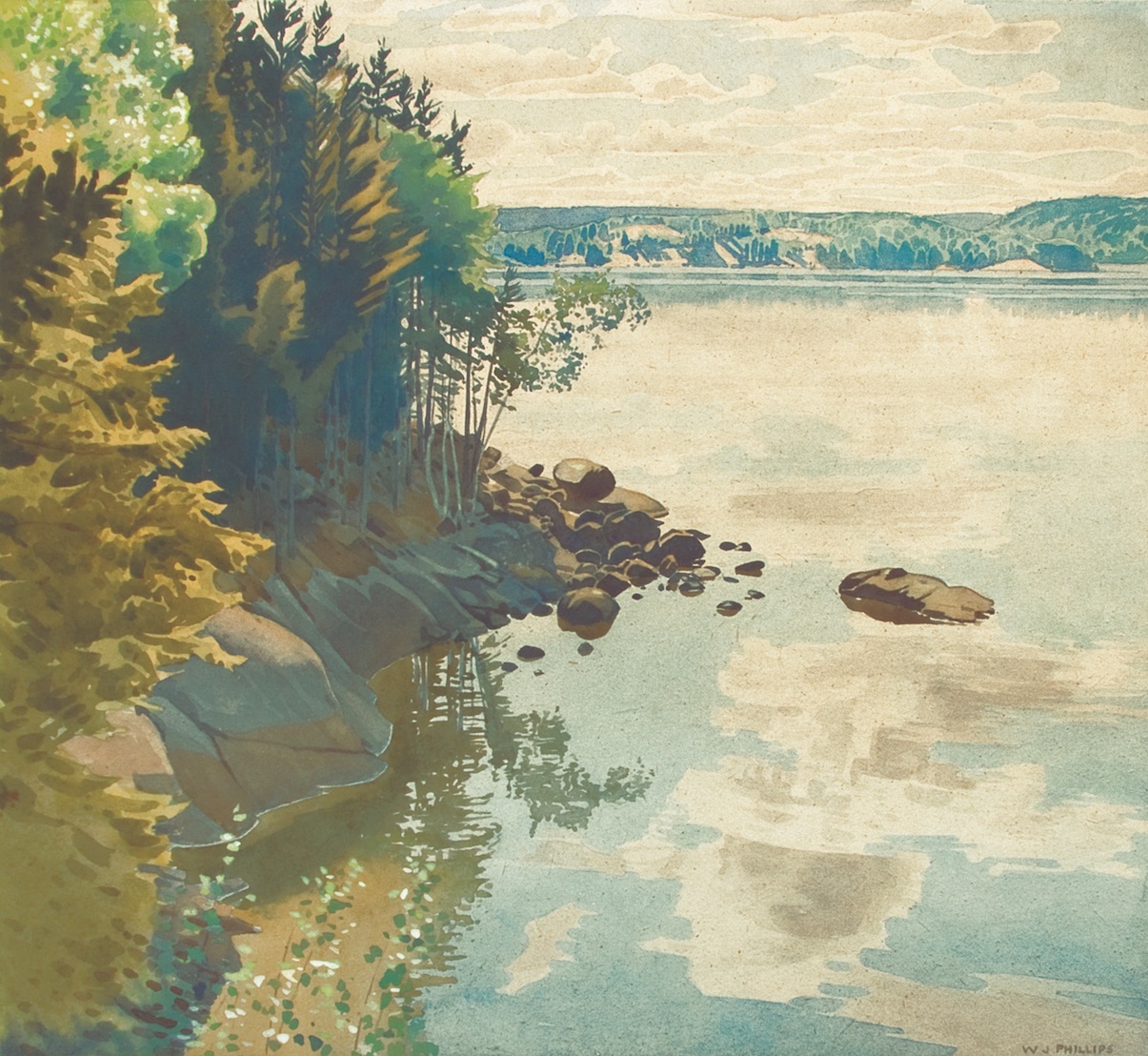
Rest
Walter J. Phillips (1884-1963)
Rest, 1923
colour woodcut on paper (edition: 100)
19.8 x 29.5 cm

It is a familiar story that immigrants who long to go ‘back home’ discover when they get there that home is really what they left behind. For awhile, the Phillips family lived with his father, a now retired Wesleyan Methodist minister, who objected to the children walking to the village to get a Sunday paper. The children, of course, were thoroughly Canadian, and disliked England. They missed the winter, and, no doubt, the lake.

Walter and Gladys decided to return to Canada, and after another summer at Muskoka in 1925, were back in Winnipeg in September. Phillips taught another year at St. John’s tech, but by 1926, he decided that he would make his living solely as an artist. He taught privately, and began writing a weekly column on art and artists for the (now defunct) Winnipeg Tribune. He kept this column going until 1941. Throughout the 1930s, he managed to support his family through the sale of his work. There were watercolours, as always, but there were also portfolios of prints, the first of which was published in 1927.

wjp waterbaby1920 ngc
Walter J. Phillips
Water Baby, 1920
watercolour on paper
42.9 x 53.4 cm
National Gallery of Canada

His family was also the subject in many of his works. One of the first of these works was Water Baby, a watercolour which exists in a couple of versions, one of which was purchased by the National Gallery of Canada. This is how Phillips described it in Wet Paint, an unpublished manuscript, probably written in about 1930:

Painted from a small study of my eldest daughter made some years ago at the Lake of the Woods one warm afternoon. She was, I remember, lazily happy in the heat, and when I was finished, she soon slipped behind the cloud reflected in the quiescent water, for she swam like a fish.

The painting was direct and transparent, completed on dry paper, and presented no special difficulties. Nor does the arrangement call for any comment save that the digure is entirely dominant, and is so placed with the panel that the divisions created are in proper relation one to the other. That aesthetic relation, whether described as artistic inequality, or dynamic symmetry, was established by the ancient Greeks, and is an application of the Golden Mean to the second dimension.

The colour is a tender and high-toned scheme of subdued blues and oranges, with an occasional intrusion of green and brown. 9

Walter J. Phillips (1884-1963)
Holiday Time (Mary), 1921
colour woodcut on paper (edition: 50)
6.3 x 27.8 cm
Walter J. Phillips (1884-1963)
Lake Lilies, 1921
colour woodcut on paper (edition: 50)
12.6 x 30.1 cm

During the 1920s, the children were the subject matter of many works, both in woodcut and in watercolour. In one of these works, which exists in two different states, one can also get a special glimpse into Phillips’ sensitivity to his medium.

Walter J. Phillips (1884-1963)
Mary at the Lake, 1920
colour woodcut on paper (first state; edition: 50)
25.4 x 12.3 cm
Walter J. Phillips (1884-1963)
Mary at the Lake, 1920
colour woodcut on paper (second state; edition unknown)
25.4 x 12.3 cm

The water in one of the states shows an effective use of the woodgrain to depict waves on the water. This had also been a favourite device of the Japanese, with their incredible sensitivity to this medium.

Walter J. Phillips (1884-1963)
Summer Idyll, 1926
woodcut on paper (edition: 100)
55.4 x 30.8 cm

One of the heights in Phillips’ work in the medium is the print called Summer Idyll, based on a sketch made at the Lake of the Woods in which no less than sixteen blocks were cut to get the different colours. Once again, the wood grain is used for the lake waves. Incredibly, Phillips scrapped a first attempt at the print since he was not satisfied with the registration. His second successful addition ranks as one of his masterpieces in the colour woodcut medium.

While some have placed this 1926 work as a result of Phillips’ two summers at Muskoka of 1924 or 1925, two preliminary pencil sketches for it appear alongside a number of other sketches he drew upon for later watercolours and prints. The sketchbook however also has a preliminary drawing for a Water Baby watercolour which is dated 1920. (Glenbow Sketchbook #53, ca. 1920-22).

By contrast, the familiar print entitled John, the name of the artist’s eldest son, is a very simple affair.

Walter J. Phillips (1884-1963)
The Bather, 1923
colour woodcut on paper (edition: 100)
27.7 x 18.7 cm

But perhaps the real subject is the water, a very impressive and convincing pictorial achievement.

Phillips’ wife Gladys was also the subject of a number of works, such as the work he entitled Gloaming, which exists in two versions or states.

Walter J. Phillips (1884-1963)
Gloaming, 1921
colour woodcut on paper (first state; edition: 50)
24.4 x 21.1 cm
Walter J. Phillips (1884-1963)
Gloaming, 1925
colour woodcut on paper (second state; edition: 50)
24.4 x 21.1 cm
The print was substantially re-worked in its 1925 state. Phillips corrected the length of the spreader bar at the beam of the canoe. The water’s edge appearing in the first state has now disappeared.
wjp family at lake of the woods
Walter J. Phillips
The Family at Keewatin, 1929
watercolour on paper
37.5 x 50.9 cm

The year 1929 was the last year the family summered at Keewatin. John was apprenticed at Brigden’s in Winnipeg that year, and the Depression began with the financial crisis. This was also the time that Phillips turned his attention to wood engraving. This is a black and white wood cut medium in which gravers are used on a piece of hard wood, cut across the grain, rather than along the plank of a relatively soft wood as is the case in the woodcut. By this time. Print collectors had turned their attention to this black and white medium, much to Phillips, initial displeasure.

But he soon mastered this medium too, and wood engravings would become part of his production from then on.

Walter J. Phillips (1884-1963)
The Island, 1918
colour woodcut on paper (edition: 50)
12.6 x 23.7 cm
Walter J. Phillips (1884-1963)
The Island, Lake of the Woods, 1925
woodcut on paper (edition unknown)
12.5 x 15.3 cm
In this print, derived from the earlier colour woodcut, the emphasis is on line, printed in black ink, but lacking the sophistication of the wood engraving.
192
Walter J. Phillips (1884-1963)
Laclu, 1933
wood engraving on paper
12 x 12.6 cm
edition unknown

I can’t resist leaving the Lake of the Woods without another lengthy quote from Walter J. Phillips. This one is on the falls of Rushing Rivers, on the east side of Lake of the woods. It will allow us to compare Phillips’ handling of the same subject in both the colour woodcut medium and the wood engraving. This experience dates back to 1915, as Phillips recalled after 1940, by which time he had moved to Calgary.

I first paddled up Rushing River, Lake of the Woods, more than thirty years ago. It was a long trip at that time– a run in the launch to Blindfold Lake–portaging the canoe over the falls there–a five mile paddle to the river. Now a road crosses the river just above the falls.

I shall never forget that first visit. An hour’s paddling in the hot sun brought us to the river. As we proceeded, the cool shade of the overhanging trees and the propinquity of the water were very refreshing. In the depths of the river stream I saw fish darting; I watched with enjoyment the new vista that each turn of the stream revealed and the banks as we sped by them–moss-covered rocks. White birch-boles, wild rice, white lilies The forest wove its spell about us.

Once we chanced on a scene straight from the pages of Fennimore Cooper– a young Indian girl plucking a water-lily to put in her hair. A little further on was a small clearing on which were pitched a group of birch-bark teepees. Then came the murmur of the falling water– faint at first, but attaining the dimensions of a roar as we progressed, and bye and bye, negotiating the ultimate turn, we saw the falls, a gleaming slash of white across the rich verdure and grey granite.

It is not a large waterfall, but none has pleased me more. Perhaps the magic of the moment, the charm of the setting, or the cumulative interest of the approach with that dramatic crescendo of sound at the end–watever it was, I cannot forget the sight nor the sound of that remote little fall… 10

Walter J. Phillips (1884-1963)
Picking Waterlilies, 1915
etching on paper (edition: unknown)
6.1 x 15.6 cm
Walter J. Phillips (1884-1963)
Rushing River, Lake of the Woods, 1920
colour woodcut on paper (edition: 50)
156
Walter J. Phillips (1884-1963)
Rushing River, Lake of the Woods, 1931
wood engraving
13.9 x 17.1 cm
edition: 200
205
Walter J. Phillips (1884-1963)
Waterfall, Lake of the Woods, 1934
wood engraving on paper
11.1 x 18.8 cm
edition unknown

Conclusion

As one compares Phillips and his work to the other Canadian artists who have depicted the landscape of the Canadian Shield, a number of differences are self-evident. While Phillips’ contemporaries, the Group of Seven, pursued the Northern landscape primarily in other parts of Ontario and Quebec, and eventually in the Rockies and the real North—the Arctic—Phillips’ work was accomplished almost entirely in Western Canada.

He often felt that this put him at a distinct disadvantage, but that disadvantage was increased even more because he insisted on painting in watercolour, when oils ere preferred, and he insisted on making prints, when prints were not really considered as worthy as paintings.

He could sympathize in general with the Group of Seven, who rarely populated their landscapes, because, as he said “the Canadian forests and lakes seem remote from the haunts of man; few figures are at ease there, or seem appropriate in its transcription.” But where he did not agree was in the nationalistic aspirations of the Group of Seven. As he said:

The demand for national art, national music, national literature, seems to me unreasonable. Chauvinism cannot well be expressed in art, which is an international language if ever there was one. There are, however, certain minor facts sometimes evident in painting, that serve to determine the nationality of the subject, for they relate solely to the subject. In landscape the facts are geographic. The relation of race to art, and of geography to race, is a matter for the ethnologist. Many modern critics insist that racial characteristics have their influence in art and may be recognized. You have your choice. 11

Walter J. Phillips (1884 – 1963)
Jack Pine, 1940
colour woodcut
22.3 x 25 cm
edition: 100

We all know Tom Thomson’s famous Jack Pine, probably done in 1916 or 1917. It is indeed a great Canadian icon. I like to contrast Phillips’ Jack Pine, a colour woodcut based on a 1940 watercolour done at Clearwater Bay. Are they less Canadian? We know that the Group of Seven claimed to paint the way they did because they thought the traditional European ways were appropriate to the European landscape. They condemned these ‘foreign-begotten’ techniques and sought a manner more appropriate to Canada’s rugged, virile wilderness. Yet, we know their debt to Art Nouveau design, and we know the tremendous impetus given to MacDonald and Harris by their visit to an exhibition of Scandinavian art in Buffalo in 1913. As MacDonald said, “Except in minor points, the pictures might all have been Canadian, and we felt, “This is what we want to do with Canada.” 12 

Art Nouveau had a definite influence on Walter J. Phillips’ work as well. For Phillips, however, the motivation was not nationalistic. As he said himself, “The beauty and wonders of Nature are as alluring as the pursuit of Art, and made of me a landscape painter.” We need look no further. And if we feel slightly uncomfortable before a ‘period’ picture of a sunset, or a child posed by the lake, with flowers and waterlilies all around, we should remember that in art, the beauty of the moment, the beauty of what is there can have a great deal to do with what we eventually make of it.

We can be grateful to Walter J. Phillips at the Lake of the Woods for making this ‘scenic trifle’ yet another aspect of a land we cherish all the more because he has revealed it to us in his own idiom.

Roger H. Boulet
Summerland, BC
©2019


Notes:

9. W.J. Phillips, “Wet Paint”, unpublished manuscript, c. 1930, p. 21.
10. W.J. Phillips, “Pictures on the Wall”, pp. 30-32.
11. W.J. Phillips, “Wet Paint,” unpublished manuscript, c. 1930, p. 82.
12. J.E.H MacDonald, “Scandinavian Art,” a lecture given at the Art Gallery of Toronto on April 17, 1931, reprinted in The Northward Journal, Number 18/19 (Moonbeam: Penumbra Press) 1980, p. 10.

Walter J. Phillips and the Lake of the Woods – Part II

07 Saturday Dec 2019

Posted by Roger H. Boulet in Canadian art

≈ Leave a comment

At Lake of the Woods  (Part Two)

In 1919, after World War I, the Phillips family first summered at Gull Harbour on Lake Winnipeg, while Walter taught at the University of Wisconsin for his second summer. The family was back at the Lake of the Woods for the summer of 1920, when they rented a cottage on Keewatin Beach belonging to a Mr. Bains. This was to be their summer dwelling every year until 1924 and from 1926 to 1929, the year the Great Depression began. That year Phillips’ eldest son John was apprenticed to Brigden’s of Winnipeg, an art, photography and engraving firm.

Walter J. Phillips (1884-1963)
Whitefish Bay, Lake of the Woods, 1919
colour woodcut on paper (edition: 50)
14.1 x 20.3 cm

‘The Lake’

The Phillps family loved the Lake of the Woods, and the artist left many written comments about ‘the lake.’ He also described his approach to its unique landscape in a number of texts, which are primary documents for his work at this time in both the watercolour and the colour woodcut medium. Many of Walter J. Phillips own observations are quoted extensively here.

On the prairies, the entire professional class summers at ‘the lake’, which is one of the most beautiful of God’s creations. It is no lake in particular. Every man is prepared to assert the superior beauty of his own. They build houses of sufficient comfort close to the water’s edge, with wide verandahs to diminish the effects of the heat, and open fireplaces within to augment it. A boathouse is the complement of each dwelling–an imposing structure, maybe, with bedrooms and baclony above, or the term may be rhetorical, and applies only to a crazy contraption of planks that serves as a landing, a diving platform, or a refuge for the lone canoe.

Our cottage at Lake of the Woods is built upon a rock, a round mass of granite jutting out into the lake, and bare of vegetation save for a grove of young jack-pines and a wild cherry tree or two. The verandah faces the sunrise, the sunset, and the northern sky, and the back-door opens on the forest. There is a miniature cove with a sandy bottom, and a ramshackle boat-house beside it. We spent the summer months here, and each night were lulled to sleep by the soothing night-cadences of the waters and the woods.

The village is two miles away over the water, but there are other cottages within call, and numerous islands in the bay. Every day brings new adventures, whether we set out in the canoe on a short excursion, or in the launch for a long one. The map pinned on the wall is a tantalizing document, as most maps are, and if there is any sense of nomenclature. The adjacent lakes and the streams spread out upon it are all alluring to the last degreee. One canoe route leads from Clearwater Bay through Granite Lake, the Lake of the Two Mountains, Moss, Bear Mountain, Crow, Duck and Rush Lakes, back to the starting point. Desirable places; who would not wish to see them? (5)

Walter J. Phillips (1884-1963)
Two Lakes, 1921
colour woodcut on paper (edition: 50)
21.5 x 34.7 cm
Walter J. Phillips (1884-1963)
Long Bay, Keewatin, 1922
colour woodcut on paper (edition: 50)
18.5 x 35.7 cm

One wonders why relatively few artists have worked at the Lake of the Woods. Paul Kane camped there in 1846 and Frederick Verner in 1873. Much later, Frank Johnston worked there too starting in 1921, when he took on the Directorship of the art school in Winnipeg, the year of his break with the Group of Seven. He sketched there with Phillips.

But like the prairies, many artists have found the terrain a bit monotonous.

Many who have traveled regard the Lake of the woods as a scenic trifle. The monotony of outlook, where every island, every headland and every bay seem the same, deceives only the casual or the dyspeptic observer. I am always glad to be back there and, wherever I may have been, feel tempted to record some of the beauty that is everywhere apparent beside those peaceful waters. This lake is dependent for interest on such decorative trivialities as tree-traceries, sunlight and shadow, lichen-covered rocks and translucent water.

If the lake wants in magnificence, if its waters lack the rhythmic movements of the sea, if its islands have not been pushed up very far, it still appeals with an intimacy that makes every rock and every tree a possible shrine of beauty. Here, the pictorial interest, more often than not, centres in the foreground, in an arabesque of branches, a pattern of foliage, or rocks, and frequently boathouses, docks and boats and perhaps their reflections. (6)

Norman Bay (Number 2)
Walter J. Phillips (1884-1963)
Norman Bay (Number 2), 1922
colour woodcut on paper (edition: 100)
22.3 x 25 cm
Walter J. Phillips (1884-1963)
Crowe’s Island, Lake of the Woods, 1919
colour woodcut on paper (edition: 50)
25.5 x 12.3 cm

More than one landscape painter has confessed that the lake is uninteresting. It is true that the country around is distressingly flat, almost as flat as the water, though on a higher plane. Yet beauty is everywhere apparent.

There are the trees– the jack-pine, though a shapeless thing, disposing its drooping branches in grotesque but graceful curves, the birch, whose opalescent bole reflects the colours of surrounding things; the poplar, with twisted branching, delightfully capricious, and dancing leaves, – a medley of dark green discs, spinning golden guineas, oval mirrors the colour of the sky, and, when the light shines through, instead of upon or athwart them, golden green; the pines, with wheel-shaped bunches of dark-green needles, making a splendid foil for the rest.

There is the water – rivers and rapids, modest falls, gently rippling water whose elusive forms are difficult to follow. I know a dream river, created for canoes and landscape painters. Trees overshadow it, and water-lilies bloom below its banks. It is clear and deep and narrow. No wind disturbs its serenity. All the way up one hears the rising music of its falls, and eventually one’s eyes are blessed with the sight of them.

There are the islands, and there is the open sky, which is more beautiful than the dweller in the mountains imagines.

Walter J. Phillips (1884-1963)
The Island, 1918
colour woodcut on paper (edition: 50)
12.6 x 23.7 cm
Walter J. Phillips (1884-1963)
Flying Island, 1922
colour woodcut on paper (edition: 50)
25.2 x 23.7 cm

Trees

The monotony of outlook at the lake where very island seems the same deceives only the casual observer. It palls on the painter of unusual, dramatic, or cataclysmic effects; it even wearies the average sketcher, until he has adjusted his perception to its restrictions. He grows tired of portraying trees, rocks and rippling water, in perpetual sunshine; he is limited sadly in the possible variations of his themes. Moreover, he is mostly forced to remain at water-level. In spite of their variety in detail, his pictures bear a family resemblance. He hesitates to bring too numerous a progeny.

On first acquaintance with the lake the artist starts with a conventional landscape, with his horizon a third of the way up or down the panel, a tree in full stature about a third of the way across, reflected in the water, and a foreground of rock and vegetation. His next sketch differs to the extent of two trees instead of one.  Bye and bye he moves his horizon, later he leaves it out altogether.

Walter J. Phillips (1884-1963)
Rain, Lake of the Woods, 1927
woodcut on Goyu paper (edition: 250)
13.4 x 22.6 cm
Walter J. Phillips (1884-1963)
The Stump, 1928
colour woodcut on paper (edition: 300)
17.1 x 23 cm

He learns to amputate the trees, showing perhaps only their crowns, with flying clouds behind, or only the roots sprawling grotesquely in a litter of brown pine needles.

[Narcisse] Diaz first had the courage to paint truncated trees. His first effort was regarded as quite a joke. He would ask visitors if they had seen his latest stem.

Going one better than Diaz in the matter of trees, the artist in desperation, inverts them, that is, he paints reflections in the lake, with only a strip of the shore showing in the composition. Meanwhile he has done them from above and below.

Then he yearns for something new. The water attracts him, not as a vehicle for suicide, but as a spectacle with decided pictorial possibilities, never still, never the same, reflecting something in every state, and moving rhythmically.”

On open water the reflections of the sky on the nearer ripples are a fascinating study. Sometimes clouds appear upon it, as a multitude of small ovals, enveloping others of different colour or tone, in form resembling the concentricities of a cut agate. They appear and vanish in a flash, and dance with an abandon that inspires all beholders. There is the sheen of the sun on the ripples – countless images of the sun that dazzle and glitter – with a blinding brilliance impossible to reproduce in pigments.

Walter J. Phillips (1884-1963)
The Dock, 1922
colour woodcut on paper (edition: 100)
18.2 x 27.2 cm
Walter J. Phillips (1884 – 1963)
Poplar Bay, Lake of the Wood, 1930
colour woodcut, edition: 100
23.9 x 33.5 cm
Walter J. Phillips (1884-1963)
Moonlight, Lake of the Woods, 1927
woodcut on Goyu paper (edition: 250)
18.7 x 15.4 cm

The Light

Phillips was always entranced by the light of Canada. And while he did paint a number of nocturnes, as any landscape painter must, it was the bright light that held his attention.

152
Walter J. Phillips (1884-1963)
Lake of the Woods, 1931
colour woodcut
16.4 x 23.9 cm
edition: 200

At the lake the sun is nearly always shining, creating sharp shadows, sparkling lights, and a definite divergence between cool and warm colours. The atmosphere also tends to define the whole landscape with a clarity and a strength unknown in damper climates. Distances that would be blue elsewhere, here retain their local colours, and the blues are driven to a more distant horizon. There is little or no haze to suggest mystery and breadth… (7)

And he never failed to be interested in beautiful sunsets either, always spectacular at the Lake of the Woods.

Walter J. Phillips (1884-1963)
The Path of Gold, 1919
colour woodcut on paper (edition: 50)
12.4 x 25.3 cm
Walter J. Phillips (1884-1963)
The Golden Hour, 1918
colour woodcut on paper (edition: 50)
17.3 x 16.3 cm
Walter J. Phillips (1884-1963)
Sunset, Lake of the Woods, 1928
colour woodcut on paper (edition: 300)
18.2 x 21.3 cm

Clouds

The evening sky over the end of the bay is laced with the wisps of golden cloud that Turner loved to paint. The moon is low on the horizon. We are between the sun and the moon, and this is the golden hour. The suffusion of golden light creates soft harmonies and in a measure mitigates the chromatic crimes our neighbours have committed on their boat-houses. The shadows are cool and enhance the brilliance of the light.

The wispy clouds deepen to crimson as we sit. A fine sunset. It is often remarked that sunsets are rarely painted, although artists must be aware that such are the only phenomena observed by the common man, save the earthquake and the blizzard. A crimson sky is hard to ignore. It is lovely, considered in relation with the whole vault of the heavens, and the visible earth, but crude and strident in itself, without context. Generally the eastern sky discloses a subtler beauty which one often is too preoccupied to see. The perception and the enjoyment of colour in nature is not for the man with an untutored vision, however keen it may be. Only the sunset was made for him. And for the painter with pride, an immense replica of his own perverted fancies is set up in the sky. “No arrogant man,” said Constable, “is allowed to see nature in all her beauty.” Turner painted many sunsets, the most famous in pictorial art. He employed invariably a very wide angle of vision as an aid in the expression of grandeur. His reds were concentrated in small areas, and they shone with deceiving intensity. But time and the London air have played havoc with his work. His reds are now black. Few others have been entirely successful in depicting crimson clouds at sunset. No pigment is sufficiently brilliant and transparent to reproduce the tremendously high light that the sun throws upon these clouds. Vermilion is the nearest red, but it is an opaque heavy colour. By reducing the tones of all surrounding things, – that is, by painting them darker than they really are, an approximation of truth may be realized.

Here at the Lake of the Woods majestic cumulus clouds often rise in the eastern skies in the evening. Tinted by the sun, they reflect its last rays – gold, orange, red, and at the last a ghostly grey in the night. The limpid shadows that reveal its contours – the clean edges of its upper parts – the mystery of its vanishment at the horizon – the thought that its magnificence inspires – why, with this object of splendour in the heavens, who would look at a sunset? (8)

Walter J. Phillips (1884-1963)
Norman Bay, Lake of the Woods, 1920
colour woodcut on paper (edition: 50)
29.2 x 21.3 cm
Walter J. Phillips (1884-1963)
Evening Cloud, 1922
colour woodcut on paper (edition: 2)
31 x 47.2 cm

The Pendulous Branch

One characteristic device to be found in a number of  Phillips’ work is that of the pendulous branch. He himself noted:

Many people have remarked that my paintings display a fondness for the tangled foregrounds, seasons of foliage, and particularly for pendulous branches. They say, it looks Japanese. Experience at the lake, however, might teach them that such are typical of the wild Canadian woods; that vegetation obscures the view nearly everywhere, and that the tangle of growth is so thick that often an exe is needed to cut a way through. If they have kept to the beaten path, then they probably respect convention in art as well as in life.

Walter J. Phillips (1884-1963)
Morning, 1924
colour woodcut on paper (edition: 150)
18 x 19.3 cm

It does not follow, of course, that because this interwoven growth is there it must be painted, but it is often of great beauty in pattern. Who has seen and has not admired Tom Thomson’s Northern River? There are occasional open views, but more often than not the beholder sits under an umbrageous tree to see and digest them. From that position the same thing occurs all over again – a branch cutting obtrusively across the field of vision.

It is justly stated that God abhorred exact reproductions in his scheme of creation. It is true that no two leaves are alike. The element of deviation from absolute perfection endows every object and every living thing with an individuality that claims attention. If the deviation is slight, we have beauty, if considerable, deformity. “There is no excellent beauty that hath not some strangeness in the proportion” said Bacon.

Walter J. Phillips (1884-1963)
Evening, 1921
colour woodcut on paper (edition: 50)
19.6 x 18.4 cm

Notes:

5 W. J. Phillips, “Wet Paint”, unpublished manuscript, c. 1930, p. 86.
6 W.J. Phillips, “The Canadian Scene” (Toronto: Thomas Nelson and Sons Ltd.) 1928, p. 17.
7 W. J. Phillips, “Wet Paint”, unpublished manuscript, c. 1930, p. 49.
8 W. J. Phillips, “Wet Paint”, unpublished manuscript, c. 1930, p. 86-92.


On to Walter J. Phillips and the Lake of the Woods Part III

Walter J. Phillips and Lake of the Woods – Part I

07 Saturday Dec 2019

Posted by Roger H. Boulet in Canadian art, visual art

≈ Leave a comment

Tags

Walter J Phillips

Introduction

Walter J. Phillips art piece
Walter J. Phillips Lake of the Woods, 1926 watercolour on paper 38.1 x 41.9 cm Nicki and Bryce Douglas Collection, Douglas Family Art Centre, Kenora, Ontario.

In March of 1990, at the invitation of Lakehead University, I gave an illustrated talk on the subject of Walter J. Phillips and the Lake of the Woods. When I was contacted by Sophie Lavoie, Curator of the Muse: Douglas Family Art Centre, informing me of the exhibition W.J. Phillips: At the Lake at the McMichael Canadian Collection, Kleinburg, Ontario, from 15 February to 10 May 2020. I recalled the lecture from three decades ago, and thought I could recast my old notes into a new blog entry.

The Nicki and Bryce Douglas Gift to the city of Kelowna consists of about 65 works by Walter J. Phillips, centred on the Lake of the Woods area. It celebrates the idea of ‘summers at the lake,’ something dear to the Douglas family, as it had been to the Phillips family several decades previously. Phillips found much inspiration at ‘the lake’ with his own family, and fortunately, he recorded his thoughts in miscellaneous texts, both published and unpublished.

RHB

wjp rest woodcut2
Walter J. Phillips (1884-1963) Rest, 1923 colour woodcut on paper (edition: 100) 19.8 x 29.5 cm

This essay is about Walter J. Phillips and the Northern landscape, more specifically that of the Lake of the Woods. The lake straddles the Ontario-Manitoba border, at their southern-most borders, the southwest in Ontario and the southeast in Manitoba. If you drive through northern Ontario going west, you come to the Lake of the Woods after days of lakes, rocks and pines. The Lake of the Woods marks the border between the Canadian Shield country and the great plains to the West. Coming from the west, you come to the lake after countless miles of flat open prairie. The transition is rather abrupt. All of a sudden, the landscape is dotted with coniferous trees, rocks and lakes of varying sizes. Lake of the Woods is one of the larger lakes, and extends southwards into Minnesota. Most of the ‘cottage country’ seems to be centred around Kenora, on the northern edge of the lake. In fact, the name Kenora is an amalgamation of Keewatin, Norman and Rat Portage, the latter being the original name of the place, something to remember as we look at the titles of some of Phillips’ works, especially Keewatin and Norman.

Early years; Immigration to Canada

Great Britain was the birthplace of some of the greatest Canadian artists, including Fred Varley, Arthur Lismer, and J.E.H. MacDonald, to name a few of Phillips’ contemporaries, who would become members of the Group of Seven. Many came to Canada and were to produce a very different kind of art than that of the Group of Seven. One of these was Walter Joseph Phillips.

He was born at Barton-on-Humber on October 25, 1884. As his father was an itinerant Wesleyan Methodist minister, the family moved about a great deal. He did take some evening art classes relatively early on, and eventually attended more professional art classes at the Municipal College of Art in Birmingham, while going to a Boarding school near Birmingham for his regular education. Needless to say, his father was opposed to a career as an artist which, for a Wesleyan Methodist, meant certain damnation. It is perhaps to get away from such an oppressive atmosphere that, in about 1902, Walter J. Phillips went to South Africa at the age of 18. There he worked at various odd jobs, hoping to raise enough money to study art in Paris.

He returned to England five years later in 1907, not having made much money, and so he set out to work as a commercial artist, first in Manchester, and then moving on to London. It was in London that he met another artist (Ernest S. Carlos) with whom he was to go on a number of sketching trips in the south of England. Perhaps with Carlos’ assistance, he obtained the position of Art Master at Bishop’s School in Salisbury in 1908. Two years later he married one of his students, Gladys Pitcher. In 1911, he held his first one man exhibition at the school where he worked. His artistic progress seems to have been constant and his sales were relatively good. In 1912, one of his watercolours, The Pier, Newlyn, was exhibited at the Royal Academy in London.

Winnipeg: 1913-1924

By 1913, he had decided to emigrate to Canada. He had not been able to convince Gladys to go back to South Africa. He had apparently told her too many stories about life with snakes. They decided on Winnipeg for “no particular reason”, although they had relatives in Toronto and in Vancouver, and thought that Winnipeg would be far enough away from both.

They sailed from Liverpool with their infant son John on the SS Franconia, arriving in Portland, Maine, then taking the train to Montreal, and another train to Winnipeg, where they arrived on June 8, 1913. Gladys was four months pregnant with their next child Margaret. After various rooms and apartments during their first year in Winnipeg, Phillips purchased a home at # 32 Bannerman Avenue in north Winnipeg. From that time, Phillips taught various subjects at St. John’s Technical School, a position he kept until 1924.

Walter J. Phillips (1884-1963) Evening on the Red River, 1916 watercolour on paper 16.5 x 29.2 cm

In 1914, the Phillips family spent their first summer holiday at Lake of the Woods, renting a room at Norman. He would return to the Lake of the Woods to sketch at different times of the year, such as at Easter break. But the family did not really begin to vacation there regularly until 1920, after the First World War.

In Winnipeg, one of the first artists Walter met was Cyril Barraud, an English-born etcher and watercolour painter who lived on the second floor of a house in Norwood across the Red River from Winnipeg. Barraud had also arrived in Canada in 1913.  The two artists held a joint exhibition of their work at the Richardson Brothers Gallery on Donald Street in October of 1914. Phillips exhibited many of his new Lake of the Woods subjects along with earlier work he had brought with him from England.

First Etchings in 1915

The friendship with Barraud resulted in Phillips’ first attempts at etching. Barraud was an example to Phillips since he managed to earn a living from the sales of his work, as well as from a teaching position at the newly established Winnipeg School of Art. Phillips learned the technique from Barraud in the fall and winter of 1914, and produced his first nine etchings in 1915. This was the year Barraud left Winnipeg to join the Canadian Expeditionary Force, and Phillips bought Barraud’s etching press, tools and papers.  The first nine etchings were followed by seven in 1916 and twelve in 1917. Of course, he continued to work in watercolour as well.

Walter J. Phillips (1884-1963) Whitefish Bay, Lake of the Woods, 1915 etching on paper (edition: unknown) 13.2 x 21.2 cm
Walter J. Phillips (1884-1963) Wooded Shoreline, Winnipeg River, 1915 etching on paper (edition: unknown) 17.5 x 27.5 cm
Walter J. Phillips (1884-1963) The Rapids, 1916 etching on paper (edition: unknown) 17 x 26.8 cm

Many of Phillips’ etchings were of Lake of the Woods subjects, sketched during various excursions to the Kenora region. 

Phillips sold his first etchings “literally through the Richardson’s”, as he said, and this is how he told the story:

They framed a few of my etchings and put them in the window for the populace to see. The people did not react, at least in the way we hoped. However, one day a lady was having some difficulty with her new car and finally backed right into the Richardson’s window in which my prints were displayed. These became a sorry mess once the plate glass crashed and shattered. The lady’s husband made no bones about it, and paid for all the damage. Thus, fortuitously, I acquired my first patron. (1)

A more bona fide patron was the National Gallery of Canada whose trustees purchased two etchings in 1916.

Walter J. Phillips (1884-1963) The Lake, 1916 etching on paper (edition: unknown) 21.3 x 34.3 cm. One of the etchings purchased by the National Gallery of Canada in 1916.
Walter J. Phillips (1884-1963) Kenora, 1917 etching on paper (edition: unknown) 16 x 22.5 cm
Walter J. Phillips (1884-1963) The Backwater, 1917 etching on paper (edition: unknown) 13.1 x 15.5 cm
Walter J. Phillips (1884-1963) Wooded Shore near Keewatin, 1917 etching on paper (edition: unknown) 15 x 23.6 cm
Walter J. Phillips (1884-1963) The Lily, 1918 etching on paper (edition: 50) 27.4 x 17.9 cm Probably Phillips’ last etching. It is dated ‘1918’ in the plate.

Colour Woodcuts

But Walter’s etchings did not satisfy him for long:

My thoughts were in colour; consequently, I had little sympathy with the convention of line as a means of expression: I came to abominate the cold unresponsive nature of metal, the smell of acid and oil, and the dirtiness of printing inks. (2)

I made a score of etchings before I discovered my comparative antipathy to metal and my atavistic zeal for wood-working, and I tried my hand at aquatint and lithography. (3)

Phillips made about thirty etchings in all before turning his attention to the colour woodcut. He was probably experimenting with colour woodcuts late in 1916 or early in 1917. As he related:


I had no guide whatever (remember–Winnipeg was hardly an art centre) excepting a very brief article in The Studio written by Allen Seaby which I read after struggling for months. I have a stubborn streak, however, and I determined to find out all about it, with or without help. I was beset by difficulties from the start, chiefly with regard to paper. I did not know there is no good substitutes for Japanese papers. Cutting the blocks was simple enough, but registering the blocks puzzled me for awhile. (4)

Apart from difficulties in registration, the proper method of sizing paper eluded him completely. Nevertheless, after one aborted attempt, and some prints of experimentation, Phillips produced his first original woodcut in 1917, entitled Winter, printed in an edition of 50.

Walter J. Phillips (1884-1963) Winter, 1917 colour woodcut on paper (edition: 50) 14.3 x 24.1 cm. This was Phillips’ first colour woodcut.
Walter J. Phillips (1884-1963) Dying Pines, 1917 colour woodcut on paper (edition: 50) 24.2 x 11.8 cm

From this time on, Phillips worked principally in the medium of the colour woodcut, besides that of watercolour. His first attempts at the woodcut could be described as being a little crude, but he quickly improved. He soon learned to dispose of the heavy outline of the key block, in favour of overlapped and gradated tones, which were very much like watercolour. Small wonder that Phillips found the medium so sympathetic. The inks were water-based and didn’t smell.

But he did not abandon the etching medium until about 1919, and we find some subjects appearing in both media, based on subjects first sketched in the area of Lake of the Woods.

Walter J. Phillips (1884-1963) Winnipeg River at Minaki, 1917 etching on paper (edition: unknown) 17.6 x 19 cm
Walter J. Phillips (1884-1963) Winnipeg River at Minaki, 1919 colour woodcut on paper (edition: 50) 17.6 x 18.9 cm
Walter J. Phillips (1884-1963) The Waterfall, 1916 etching on paper (edition: unknown) 27.6 x 14.7 cm
Walter J. Phillips (1884-1963) The Waterfall, 1919 colour woodcut on paper (edition: 50) 112.8 x 15.5 cm

Notes:

  1. W.J. Phillips, “Pictures on the Wall”, undated and unpublished manuscript, p. 7.
  2. W. J. Phillips, “The Technique of the Color Wood-Cut”, (New York: Brown-Robertson Co. Inc.) 1926, p. 13.
  3. W.J. Phillips, “Pictures on the Wall”, p. 5.
  4. W.J. Phillips, “Pictures on the Wall”, p. 8-9.

On to Walter J. Phillips and Lake of the Woods – Part II


Music for Insomniacs

10 Tuesday Apr 2018

Posted by Roger H. Boulet in classical music, insomnia

≈ 1 Comment

Tags

insomnia, music for sleeping

Pierre Narcisse Guérin (1774-1833), French, Morpheus and Iris, 1811, oil on canvas, 251 x 178 cm, Hermitage Museum, St. Petersburg, Russia

Can’t sleep? Worried that you’ll miss the rainbow goddess, Iris, when she appears in the morning or maybe appear a bit more dishevelled than Morpheus in Guérin’s painting?

Music can help you sleep. It is a time-honoured tradition. Musicians performed nearby when Louis XIV decided to go to bed at night. Marin Marais composed some Trios for the Sung King’s bedchamber.

One of the first stories about music and insomnia involves the charming story about Bach’s Goldberg Variations (BWV 988). The composer wrote the great work for a Count Kaiserling, an ambassador of the Russian Imperial Court to the Elector of Saxony’s Court. Kaiserling was afflicted with insomnia. Wherever he travelled, his young harpsichordist, Johann Goldberg, travelled with him to play music during the night while the Count tried to sleep. Bach wrote the piece for Goldberg, essentially a theme with 30 variations, to entertain the Count. His Grace was delighted and rewarded Bach handsomely. A nice story, but alas, it seems to be a fabrication of one of Bach’s early biographers (1802), half a century after Bach’s death in 1750. (https://en.wikipedia.org/wiki/Goldberg_Variations)

In our marvellous digital age, you too can have a virtual Johann Goldberg playing these variations on, say, your bedside Amazon Echo device. In fact, you can use your musical time machine to conjure up a host of other musicians from different periods to add to Mr Goldberg’s musical entourage.

Bach, J.S.: Goldberg Variations, Bwv 988
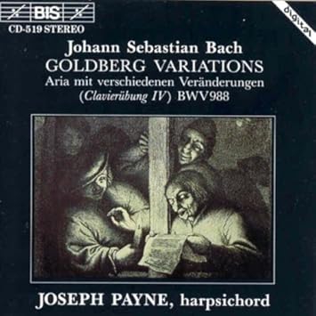
So the question is, what constitutes a viable playlist for the insomniac? The objective is to somehow induce rest, if not sleep. The Goldberg Variations are familiar to most people who like classical music. There are many, many recorded versions of the work! Some are more exciting than others. I am not sure that listening to the two extraordinary recordings (1955 and 1981) of the work by Glenn Gould would be that relaxing. In fact, they make for pretty exciting listening. My preference for the purpose at hand is a version played on the harpsichord, the quieter the better. For this purpose, volume control comes in handy. My preference is Joseph Payne’s 1991 recording on BIS CD-519.

Bach: Art of FugueStaying with Bach for a moment, my next choice would be a recording of his Art of the Fugue (BWV 1080). Bach did not specify the instrumentation for this unfinished work, so many resourceful performers have come up with their own approaches. The Art of the Fugue is essentially an exercise in counterpoint. Like the Goldberg Variations, the various canons and fugues can sound rather mathematical. My choice is a bit idiosyncratic, keeping in mind the context of insomnia. It is the version performed by the Canadian group Les Voix Humaines, a consort of viols, in this case, four of them. (ATMA Classique (ACD2-2645). If you are used to a more direct and literal interpretation of the score, this will come as a surprise. The historical context of viol playing (French and British) is brought to bear on the performance, with lots of ornamentation, so that the score is used more as a roadmap than a score, and there is a sense of archaic improvisation, but the key is the sound produced. It is one of my favourite recordings to play on my Amazon Echo device in the middle of the night.

Sainte-Colombe: Complete Works
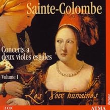
There is something mesmerizing about the sound of a consort of viols, even a mere pair of viols, and fortunately, there is quite a large repertoire of music for two or more viols. Staying with Les Voix Humaines, they have recorded the complete works of Jean de Sainte-Colombe for 2 bass viols on no less than 8 CDs. It is extraordinary stuff. The music of Sainte-Colombe was introduced to a wide public in the 1991 film Tous les Matins du Monde. Any of these albums could be used in the insomniac’s playlist. And they have recorded a lot more viol music. For English viol music, Henry Purcell’s Fantasias for viols are quite extraordinary.

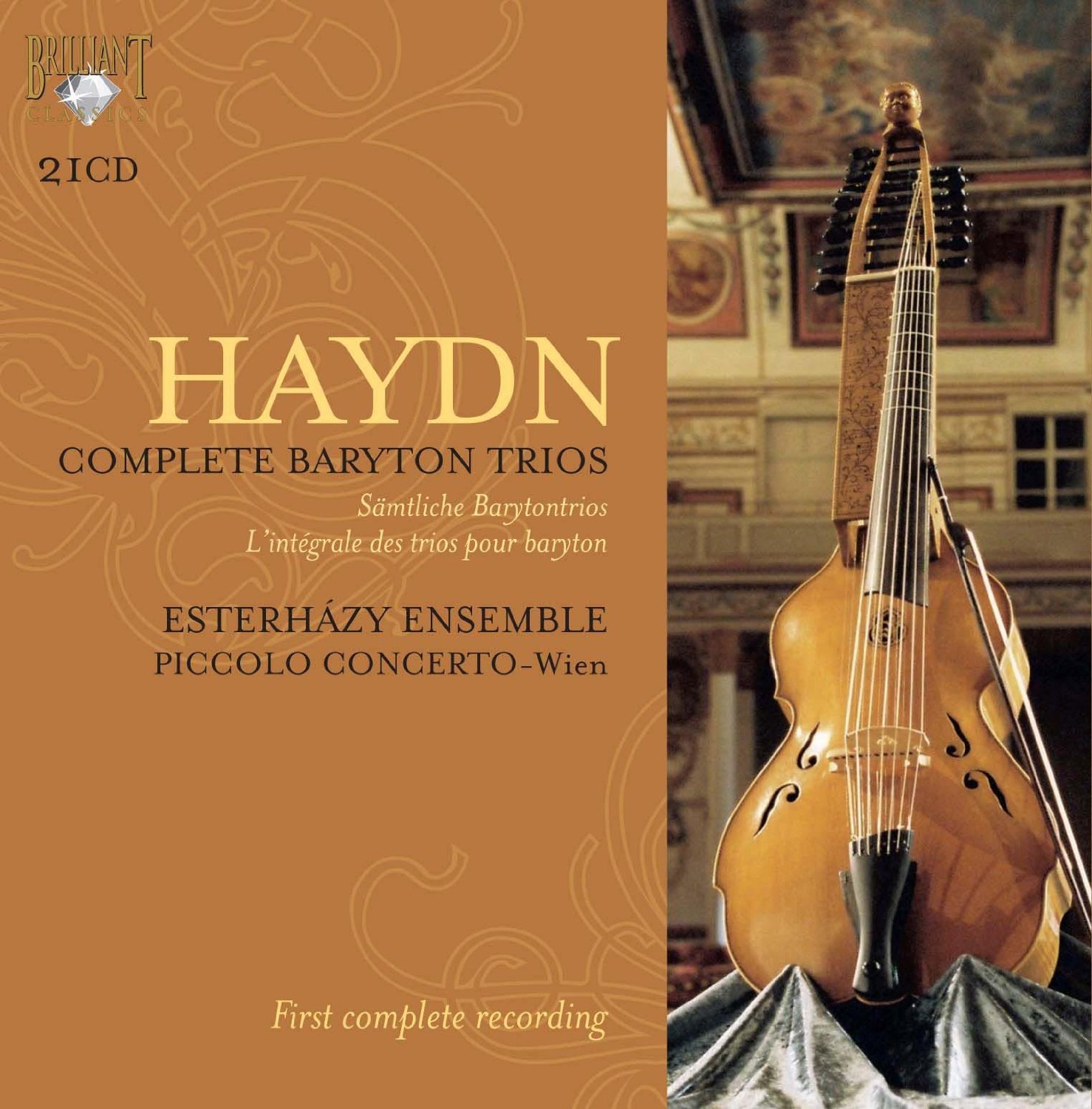
A contemporary relative of the viola da gamba was the baryton. Because Prince Nicholas Esterhazy happened to play this instrument, his resident composer, Joseph Haydn had to compose music for the Prince and his instrument. As a result, there are over a hundred trios for baryton, viola and cello. These are very mellow instruments, and the baryton trios are remarkable. Fortunately, there has been a bit of a revival of interest in the baryton as a result of the contemporary predilection for music played on original (or authentic) instruments. In 2009, one ensemble even recorded everything that Haydn wrote for the instrument, and as I am a great fan of Haydn, I bought the entire set. Some say it is boring music, but I love it. The entire set is available on Spotify Premium, the best service if you love classical music and a tremendous resource for compiling a customized playlist for the insomniac. (For Classical music, Amazon Prime Music is useless!) Haydn’s baryton trios suit the bedside playlist really well. There are examples of Baryton Trios by Hadyn on YouTube, where you can see and hear this rare and resonant instrument.

basset-horn music.jpg
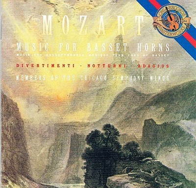
In the same period that Haydn composed his music, during his short life Mozart also wrote some night music, but his brilliant Eine Kleine Nachtmusic, K. 525 (1787) is a little too energetic for our purposes. For something a bit more suitable, his music for Basset Horns will do admirably. I am fortunate enough to have a 1986 recording of such music played by the Cleveland Symphony Winds (CBS Masterworks M2K42144). What is particularly marvellous about this recording is that the various notturnos and divertimentos are arranged in programs where the notturnos (sung by male or female voices with basset horn accompaniment) alternate with the instrumental divertimentos, usually scored for three basset horns. While I don’t advise vocal music to put you to sleep, lullabies notwithstanding, this would at least relax you. There are a few other Notturnos by Mozart, but they are actually quite boisterous affairs, suitable for a very civilized evening garden party.

Then there is Schubert, whose exquisite melodies will provide rest and delight.  None more so than his Notturno in E flat major (D.897). Several wonderful versions of this. My favourite is one performed by the Gryphon Trio in their Analekta compilation of Great Piano Trios by Beethoven, Mozart, Schubert and Shostakovich. There is a fairly loud middle section but quiet prevails in the end.

Chopin: Nocturnes
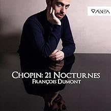
It seems natural to link insomnia with nighttime, and in a musical context, it is the Nocturne (Notturno) that first comes to mind when thinking of night music. As a rule, a nocturne will be quiet and slow. The Romantic period provided music lovers with splendid nocturnes, of which 16 were composed by the Irish musician John Field between 1812 and 1836. Well known as a performer in his time, Field seems to have originated the Nocturne as a composition for solo piano. Field’s Nocturnes were much admired by his more famous contemporary, the Polish musician Frédéric Chopin, who would write 21 Nocturnes between  1827 and 1846. Both Field’s and Chopin’s Nocturnes are perfect music for the insomniac. Lots of recordings of the Chopin Nocturnes. I have had Daniel Barenboim’s interpretations for years, but have found much delight in a recent recording found on Spotify by François Dumont. It has soothed me to sleep many times, before the 1 hour and 43 minutes have played through.

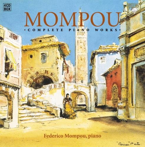
Maybe just reading this soporific text has already put you to sleep, but there are a couple of more contemporary works I have to mention. A number of years ago, I became intrigued by Federico Mompou’s Musica Callada. (1959-67) I had never heard of this Catalan composer before, let alone this extraordinary music. The very idea of “silent music,” was challenging, so I purchased his complete piano works performed by the composer himself. Not being a musicologist, I can’t quite describe the Muisca Callada adequately, except that it is strangely riveting, very quiet music, hypnotic in effect. Lately, I have been playing a wonderfully sensitive performance, again found on Spotify, by Emili Brugalla.

Tavener: Last Sleep of the Virgin, Hidden TreasureAnother piece of extraordinary contemporary music is John Tavener’s, The Last Sleep of the Virgin (1991).  It was composed on the eve of the composer’s major heart surgery. He specified that the players were to perform the piece “at the threshold of audibility.” It is scored for string quartet and handbells, and the effect conveys a trance-inducing sound. (The companion piece on this particular recording, The Hidden Treasure, is not conducive to sleep).

Arvo Pärt is apparently the most performed contemporary composer in the world today. Born in Estonia, his music evolved into something simple and extraordinary. I first heard his music more than a decade ago. Then a friend lent me his newly-purchased copy of Spiegel am Spiegel and Alina. I immediately bought the CD even before returning my borrowed copy. The work has been recorded many times, but this particular recording is the treasure. And it has lulled me to blissful sleep more often than any other music. It is still the Pärt CD I play most often, and I have several, even some earlier works recorded on BIS.

All of these recordings are my current choices to induce sleep. In another time, I am sure I would have chosen others. There would have been more orchestral music in all probability. Probably much Gregorian chant which I have always loved. But given current technology and resources (Amazon Echo, Spotify Premium), these recordings are on my present list, enough to keep you in your bed at night, and enough to bring you into the arms of Morpheus.

©Roger H. Boulet
10 April 2018.

A Shared Love of Canada’s Rocky Mountains – Peter and Catharine Whyte of Banff – Part II

22 Thursday Mar 2018

Posted by Roger H. Boulet in Canadian art, fine art, painting, visual art

≈ Leave a comment

The writer acknowledges the financial support of the Whyte Museum and its archives for the research associated with the texts in this blog. Opinions in this blog text are the author’s own.

The Whyte Museum in Banff will feature an exhibition entitled Artistry Revealed: Peter Whyte, Catharine Robb Whyte and Their Contemporaries. June 17th to October 21st, 2018. A book, accompanying the exhibition, will be published. The exhibition and publication are supported by the Museum Assistance Program of the Government of Canada.


4. Banff, travels and setbacks

The wedding took place on June 30, 1930, in Concord.[i] The couple drove to Banff in Catharine’s car, a Packard Roadster, arriving in early August, intending to make their home there. At first lodging at Peter’s parents, they spent much of the summer sketching in the mountains, at Yoho, and in early September registered as guests at the Lake O’Hara Lodge. Here they spent a couple of weeks sketching with J.E.H. MacDonald. They then engaged in some arduous hiking. They also began planning the building of their house and studio which would be completed in May of 1931. In early 1931, They had travelled to Toronto and MacDonald introduced them to Lawren Harris.

In November, Peter was informed that one of his paintings had been accepted for the National Academy of Design exhibition in New York. He had submitted a work to this important exhibition at the insistence of Carl Rungius. Three of his works were also included in the spring exhibition of the Art Association of Montreal in 1932.[ii]

An initial trip in the late autumn of 1931 to Nassau, in the Bahamas, at the invitation of Fred Ambrister, a photographer whom they had met at Lake Louise, proved to be a bit of a disappointment, and the couple were on their way home by January of 1932.[iii] Back in Banff in February, they decided to take on the running of the new Skoki Ski Lodge, receiving guests in the spring of 1932. Re-opening in the spring of 1933, one of their guests, a British mathematician teaching at MIT named Raymond E. Paley, was killed in an avalanche in early April. Peter was devastated by this tragedy and blamed himself. Although an inquiry absolved him of all responsibility, Paley’s death haunted him for the rest of his life. It also ended their ski lodge venture at Skoki.

In the fall of 1933, they were in Hawaii for the winter where they sketched. Early in 1934, still in Hawaii, they purchased two steamer tickets for a round-the-world trip which lasted some eighteen months, taking them to China, Japan, the Dutch East Indies, finally returning to Banff, only to leave again on more travels to Switzerland for skiing, then back to Banff, and on to Hawaii again in 1936. A trip down the West Coast, and to Vancouver Island followed, then another through the Panama Canal, on to Europe for skiing in the Alps again. They were soon sketching in Norway in May and June of 1938. With war threatening in Europe, they returned to Banff by September to spend their first full year in Banff.

Peter’s father passed away in June of 1940. With the war now enveloping Europe, Peter decided in the summer to join the Reserve Army, and took two weeks of basic training in Calgary. He was 35. Over the next five years, Peter’s efforts and hopes of being named an official war artist met with obstacles and disappointment. Disillusioned, he requested his discharge which he received in December of 1944.[iv] Settled back into his life in Banff, he seems to have turned increasingly to alcohol.

Catharine had first remarked on his tendency to depression when they were at art school in Boston. At the beginning of their relationship, in the fall of 1927, she noted in her journal “He gets discouraged though I haven’t quite decided what about. He said he couldn’t speak good English and I wouldn’t understand. He wants to go to China; also says he’s never going to marry for you can do better work that way, which I was glad to hear. I bet him he would be famous within ten years and he bet not.”[v]  Catharine always seems to have had more confidence in him than he had in himself, believing in his superior talent. Elsewhere, she says: “He told me what he is planning to do: get a good foundation and then go back to Canada and start a school of art in Banff, and later get children to work with him and teach them, for he said he wished he’d had that, for people don’t even have faith in him now and think he does it for fun. I’ll bet Peter could do it. There is a lot to him.”[vi]

In a letter to Catharine in January of 1929, Peter confided in Catharine. “Tomorrow I will be twenty-four. Do you know, Catharine, I have never had a birthday party, not even when I was little?  Someday, when I am back from our trip, can’t we have a nice little party, just so I can say I had one? This must sound a bit childish, but there were so many things I couldn’t have when I was small and the others in our family did have, I often dreamed of doing them when I was older, just to even up things.”[vii]  The statement has more to do with his sense of being a neglected middle child.

It is interesting to note Catharine’s comments on a self-portrait he did in 1932, while she was away from Banff for a few days. Noting that during Banff Indian Days that year he had made three good sketches of the Indian camp and an Indian portrait, she adds: “He also painted a self-portrait and it’s the saddest looking thing I’ve ever seen.”[viii] The rough self-portrait sketch, unfinished, shows his head mostly in shadow, with an unusually large right ear. The face is lacking that quiet smile which one often notices in photographs of him at that time.

Over the next decade, after his discharge from the Air Force in 1944, Peter’s mental health continued to be cause for concern. But he nevertheless was able to keep his level of activity up, having decided to submit some of his works to the Art Association of Montreal in 1947, some fifteen years after first submitting to that exhibition. These were exhibited and one of the English language papers singled out “a striking composition of mountains by Peter Whyte.” On his visit to Banff that year, Fred Brigden suggested Peter and Catharine submit works to the Royal Canadian Academy and the Ontario Society of Artists exhibitions in 1948. But another opportunity presented itself when Clare Bice visited Banff in mid-September and was introduced to them by their mutual friends George and Kathleen Daly Pepper. Bice asked to borrow some of their sketches for an exhibition at the London Public Gallery. The offer was accepted and the exhibition was sent off in March of 1948. It was well received and travelled to a number of Ontario galleries, including Hart House. The sketches were also exhibited in Concord.

Catharine’s letters to her mother at this time began to mention Peter’s condition. In November of 1947, they declined an invitation to spend Christmas in Concord, with Catharine writing “I know it is wiser to stay home for a few months until Peter really feels better.” In September of 1948, she writes that “A lot of his trouble is emotional,” adding later that “He gets very tense when he is troubled or worried about something. It came to a head two weeks ago, and that caused him to be sick.” In May of 1949, she writes that “the worry and strain of the last few years since he left the Air Force have taken an awful lot out of him, and every time he gets feeling a bit better, maybe gets a picture out he wants to paint on, he gets slapped down again. Some people might have ended up by having a nervous breakdown under the circumstances but luckily it hasn’t been that, but worry is bound to tell on a person some way…”

Physically, there was some transformation as well. He was balding and had gained a lot of weight due to being less active than he had been in the 1930s. Their physician, Dr Duncan MacKenzie, suggested that part of the problem might stem from his strict Scottish Presbyterian upbringing, all three boys “having difficulties adjusting themselves now.” All of them were manifesting problems with alcohol.  “Dr MacKenzie,” she writes, “thinks Pete has lost a bit of confidence in himself…” He recommended Peter see a Doctor in Vancouver, and the couple decided to take a brief holiday in Victoria, “the first real holiday of this sort we have had since before the war.” Their visit to Dr Davidson in Vancouver resulted in the recommendation that if he could learn to relax, the anxiety and tension might be alleviated. There is no mention of alcoholism in Catharine’s correspondence of the time. But Peter’s addiction was common knowledge in Banff. Close friends were aware of it too, and it seems their good friend Murray Adaskin may have communicated the situation to Lawren Harris, soliciting advice, which was duly given.

Back in Banff, they spent some time in July at Moraine Lake where Catharine observed:

“We finally got up here. It is the sort of place we seem to like best and Pete seems more relaxed. It’s so quiet, the scenery lovely and the atmosphere informal. This is the first summer since the first one nineteen years ago when we haven’t had to plan to be back to see this person or that. It seems funny but it is so.”

Clearly, the constant interruptions at home in Banff, the responsibilities and demands on him were not conducive to his peace of mind. Nevertheless, throughout this time, there were sketching trips, and Peter’s work shows no sign of diminishing powers. He was an artist who kept his personal feelings out of his work, other than an obvious affection for his subject matter.

A few years later, Peter was diagnosed with cataracts in both eyes and these were successfully operated on in 1953 and in 1957. Peter’s state of mind may have improved somewhat as Catharine no longer mentions it in her letters. Nevertheless, he was visually impaired because of his cataracts for much of the 1950s. Between surgeries, he could only work a few hours a day.

I have stressed Peter’s condition over the 1950’s and 1960’s since his productivity decreased during that time. Catharine was much affected by his condition because they always painted together when away from Banff. But in Banff, her obligations as a hostess, and constant interruptions limited her own output.

During the 1950s and early 1960s, Peter and Catharine were actively planning their Foundation, and the building of a combined library, archives and gallery building. Peter would not live to see the institution they had planned together and died on 3rd of December 1966. The building was officially opened in 1968.

Lawren Harris, writing to Catharine in April of 1949, had suggested Peter had “the equipment, the technique, the talent to do far better work than he has ever done” provided he left Banff, adding that Banff was “a recreation and sports center primarily with nice townsfolk but no real interest in creative ferment and stimulation.”[ix] The establishment of the Wa-Che-Yo-Cha-Pa Foundation (later renamed the Peter and Catharine Whyte Foundation) made certain that there would be a permanent home in Banff for “creative ferment and stimulation.”

5. Legacy

Concluding a brief essay on Peter and Catharine’s work in 1988, their nephew Jon Whyte regretted the fact that neither had left “the legacy of a growing aesthetic vision that seemed so attainable in the early 1930s.”[x] An interesting point, to be sure, and one to which one might hastily agree. But that would perhaps be regretting intentions they did not have.  I am not sure either of them would have had such regrets. Perhaps Peter might have. His predisposition to despondency might have suggested failure, but his achievement as a painter was perhaps less a result of his lack of a “growing aesthetic vision” than a chronic lack of self-esteem. He never really recovered from the tragic death of Raymond Paley in 1933. Added to this was a desire to travel in the mistaken belief that self-fulfilment might come in an escape to an unexplored territory. But he could not escape from Banff, to which he always returned. The mountains give him a sense of place, inspired him, but they also closed him in. His academic training and his preferred subject matter may have limited the growth of his aesthetic vision. In that sense, the emulation of established figures such as Rungius and Browne was a handicap, presenting an alternate idea of success. Others, such as Lawren Harris thought him capable of moving on to new avenues of exploration, and a notion of success that he did not share.

There is in Jon Whyte’s statement an underlying premise that can also be questioned. What exactly does a “growing aesthetic vision” entail? Who determines or quantifies that growth? What are the criteria? All too often the premise reflects a modernist paradigm where progress and movement determine relevance or significance.  The achievements of many other artists have been diminished by the application of an aesthetic that was not in accordance with their own ambitions as expressed in the work they produced.

Such is the case with Walter J. Phillips, a friend of the Whytes, who had moved to Banff in the late 1940s, having taught at the Banff Summer School of the Arts since 1940. Douglas Cole questioned Phillips’ marginalization as well. In a lecture on the relationship between Phillips and the mainstream of Canadian art, Cole suggests that his “personality, media, locality and artistic content and style” created boundaries for him. He further posits that his life and character were “not such as lend themselves to mythic treatment,” in comparison, say, to Tom Thomson, Emily Carr, and A.Y. Jackson.

A similarity can be found with Peter and Catharine Whyte. While Phillips’ chosen media of watercolour and the colour woodcut further limited his reputation in comparison to artists who worked in oil, Cole adds that he did not produce “large and finished canvasses” which could be considered as major works. Again, here is a similarity with the Whytes, at least in the relative lack of big canvases. As far as locality was concerned, Phillips lived in Winnipeg, Calgary and finally Banff, away from metropolitan centres where “mainstream” art activities were more likely to occur. In Canada, that meant Toronto and Montreal. Phillips’ subjects and style were also mentioned by Cole as limitations to his reputation. Here again, a parallel can be drawn with the paintings of Peter and Catharine Whyte.  Cole also notes that Phillips “clung to an older (and …  no less valid) definition of beauty” and there again we recognize one more thing the Whytes and Phillips shared. Finally, Cole cites James Ackerman in stating that modern criticism gives priority to “the forces that make for change in art” and these are “praised more warmly than those that make for stability.”[xi]

That so many fine artists are excluded from the mainstream according to “the forces that make for change” is a matter of fact. When we examine the decades of the 1930s and the 1940s in Canada, we are dealing primarily with the aftermath of the Group of Seven in its expansion as the Canadian Group of Painters, followed by the post-war flowering of abstraction in the 1950s and the 1960s.

But Banff being Banff, the East came to the mountains, at least on holiday. If you lived in Banff in the 1940s, you could get to know a number of notable Canadian artists who came to Banff every summer to teach at the developing Banff School of the Arts. A summer sketching camp in 1933 led by British-born Calgary artist A.C. Leighton had been invited to join the University of Alberta Department of Extension’s initiative, creating the Banff School of Fine Arts in 1935. Another British-born artist, H.G. Glyde arrived in Canada to teach drawing at the Provincial Institute of Technology, becoming head of the Art Department the following year. He was also head of the painting division of the Banff School of Arts, a position he would hold until 1966.

The Canadian artists invited to teach the summer painting classes in Banff in 1940 were André Biéler, Arthur Lismer and Walter J. Phillips, the latter joining Glyde as a regular instructor. There followed Charles Comfort, George Pepper, A.Y. Jackson, J.W.G. Macdonald, and others. It would seem that the connections of the Whytes with these artists were purely social, although a number would become good friends. Perhaps closest among them, along with Walter J. Phillips who moved to Banff in 1948, were George Pepper and his wife Kathleen Daly Pepper.

Conclusion

I started this essay with a personal memory of Banff from the short time I lived there, so it seems appropriate to conclude with another. The Foundation’s building had opened in 1968, just four years before I was hired as the art curator in September of 1972. One of my fondest memories and one that has never left me was the afternoon tea ritual in the afternoon. A tea cart was rolled down a back hallway, and from an open door, tea and cookies were served to guests comfortably seated in a room warmed by a gas fireplace, now called the Swiss Guides Room. Also in that room were some paintings from the modest collection, consisting mostly of works by Peter and Catharine Whyte and the artists they knew and loved. There would inevitably be Peter’s Lake O’Hara of 1935 and his Bow Lake from the Summit of 1945, and one of his works from the Columbia Icefields. One or two of the Stoney portraits done by Peter or Catharine would hang there too, or in the staircase on the way down to the Gallery from the front entrance. Also, in pride of place, near the fireplace, was Aldro T. Hibbard’s Mount Biddle at Lake O’Hara of 1924-25.  Often, George Pepper’s large forest landscape was featured as well.

The tea and home-made cookies offered to museum visitors were a reflection of the hospitality extended to visitors for so many years by Catharine in her home a stone’s throw away. Another memory for me, of course, was tea and cookies with Catharine at the kitchen table in that memory-filled home. But I was not in Banff long enough to get to know her well.

At the beginning of Joan Murray’s August 1977 interview with Catharine, she modestly replied to Joan’s question “How do you feel about being an artist” with “I’m not a real artist; that’s the trouble, I’m really not.” And she goes on to say

“The trouble was that when we first started painting, Pete and I painted very much the same way. We used the same paints, with the same colour; the palette was the same, the same size canvas; same type of subject.”

One could, of course, disagree with Catharine about whether or not she was a real artist. Given the paintings she left behind, most people would. We might also disagree with her belief that Peter was the “real” artist.

Their place in the context of Canadian art is a difficult one to determine. Who were their peers? They had many friends and acquaintances made over the years, but these were more often social. An interesting document from 1945, annotated by Catharine in 1949, contains short comments about the artists they knew (or with whose work they were most familiar).[xii] But they did not exhibit with them, apart from Peter’s participation in the large Art Association of Montreal’s spring exhibitions of 1932 and 1947. They did not attend these exhibitions and they were not members of any of the eastern Canadian art societies, including the Canadian Group of Painters formed in 1933. This meant that there work remained unknown with the exception of the successful touring exhibition organized by Clare Bice in 1948-49. They did not attend the Kingston Conference held in 1941organized by their friend André Biéler since Peter had by then enlisted in the Armed Forces.

Peter and Catharine remained relative outsiders to Canadian art’s system, which Lisa Christiansen so clearly describes in her essay in the book that accompanies the exhibition. They did not really see themselves as part of it, perhaps because of their relative isolation, their special subject matter, and a worldview which always crossed borders naturally and easily. The international destination that was Banff always defined their world and their place in it, as much as their many travels abroad. But Banff for much of the year was an isolated community. That isolation made their works less present and less familiar to the broader Canadian art public. Their physical and spiritual distance from Toronto and Montreal meant that they were out of the mainstream.

This is not necessarily to the detriment of an appreciation of their work today. Their work must be considered on its own merits. A comparison of their work to that of their contemporaries, many of them more “modern,” re-enforces their unique contribution, which is above all, a celebration of place.

Canadian art history is under constant revision and correction. Strong western voices, past and present, are constantly emerging and are celebrated, and with the emergence of strong western voices, not least of which are the proud voices of Indigenous artists, there is no doubt that more people will come to appreciate the very special and unique contribution Peter and Catharine Whyte made to Canadian art. At the very least, their love of the Rocky Mountains and their generosity of spirit should be celebrated.

© Roger H. Boulet
Summerland, BC
3 March 2018


Notes to Part II

[i]. Peter’s best man was fellow artist and Boston School student Gardner Cox. Cox had also visited Banff in the summer of 1929 at the same time as Catharine.

[ii]. Works exhibited in 1932 were “Lake O’Hara,” and two sketches “Yoho Valley” and “A Lake in the Rockies”. Works exhibited in 1947 were “Stonies” and “Mountain Solitude.” Evelyn de R. McMann. Montreal Museum of Fine Arts formerly Art Association of Montreal Spring Exhibitions 1880-1970. Toronto: University of Toronto Press, 1988., p. 399.

[iii]. Catharine’s frank reaction to the whole adventure, on their way home aboard the Empress of Australia, was that “We think it best to call this trip a scouting trip; we have learnt a heap about travelling and have decided that the thing to do is to stick to painting Indians and mountains.” In Whyte, p. 86.

[iv].  Caught in the bureaucracy of the Armed forces, when Peter arrived in Ottawa on 30 October he had not been informed of the requirement that he would have had to be in Ottawa the previous 20th of September when the Canadian War Records office had sent the designated “war artists.” For more information on Peter’s service, see Nancy Townshend, A History of Art in Alberta 1905-1970. Calgary: Bayeux Arts Inc., 2005, pp. 63-66.

[v].Whyte, p. 42.

[vi]. Whyte, p. 40.

[vii]. Whyte, p. 52.

[viii]. Whyte, p. 89.

[ix] Lawren P. Harris to Catharine Whyte, 4 April 1949. M36.318.

[x]. Whyte, Jon. “Mountain Painters” in Mountain Glory – The Art of Peter and Catharine Whyte  Banff: Whyte Museum of the Canadian Rockies, 1988, p. 29.

[xi]. Douglas Cole “Out of the Mainstream: Walter J. Phillips and the Context of Canadian Art” in Manitoba History, Number 3, 1982. (http://www.mhs.mb.ca/docs/mb_history/03/phillips_wj.shtml) (28 January 2018).

[xii] Author unknown. The development of painting in Canada, 1665-194.  Toronto: Ryerson Press,  1945, 65pp. Catharine’s hand-written notes appear in the margins of biography section.  06 D49 Pam.

A Shared Love of Canada’s Rocky Mountains – Peter and Catharine Whyte of Banff – Part I

22 Thursday Mar 2018

Posted by Roger H. Boulet in Canadian art, fine art, painting, visual art

≈ Comments Off on A Shared Love of Canada’s Rocky Mountains – Peter and Catharine Whyte of Banff – Part I

The writer acknowledges the financial support of the Whyte Museum and its archives for the research associated with the texts in this blog. Opinions in this blog text are the author’s own.

The Whyte Museum in Banff will feature an exhibition entitled Artistry Revealed: Peter Whyte, Catharine Robb Whyte and Their Contemporaries. June 17th to October 21st, 2018. A book, accompanying the exhibition, will be published. The exhibition and publication are supported by the Museum Assistance Program of the Government of Canada.


Introduction: Banff, as an International Destination

When I lived in Banff (1972-74) locals used to say that if you waited long enough, you would meet someone you knew on Banff Avenue no matter where they lived. Banff was an international destination. Everyone eventually visits Banff. And this proved true, but what was also true is that a lot of people you won’t know come to Banff and you might get to meet them there, and connect.

What made Banff the international destination that it was is an interesting story, and it inevitably affects those who live there and those who visit. It is a unique place. For those few actually born in Banff, it provides a different world view because from early on, they have an expansive view of community.

The history and development of Banff National Park are linked to the tourism amenities made available from its early history. Added to these, the development of mountaineering and skiing communities would bring even more visitors to Banff. The creation of the Alpine Club of Canada in 1906–in Winnipeg of all places– promoted mountaineering in the ranges in Alberta and British Columbia. Another endeavour, in Banff, was the Banff Winter Carnival, the result of an effort Austrian skier Conrad Kain who built a ski jump down Tunnel Mountain and organized a winter sports festival in 1911, which evolved into the Banff Winter Carnival in 1917.

These events attracted young people in Banff, and the ski industry developed as a result. Cliff White, the eldest son of pioneer merchant David White, helped the fledgeling ski industry to develop. His brother Peter was an avid skier from a young age. But he was destined for an artistic career, rather than an athletic one.

2. Peter Whyte in Banff

Born on 22 January 1905, he manifested some interest in drawing. He attended high school in Banff but never graduated. While in his teens, he took a correspondence course in cartooning, and developed his artistic interests on his own, without any encouragement from his parents.

Peter had been inspired by the first professional artist who settled in Banff. Nora Drummond-Davies (1862-1949) is known to have settled in Banff as early as 1916. She taught art classes in the local schools where one of her students was Peter White.

The year 1916 also brought a very illustrious visiting artist from Boston in the person of John Singer Sargent (1856-1925).  He usually travelled to Switzerland for the summers, but given the dangers to commercial shipping wrought by the Germans, Sargent decided to come to Canada instead. The Brewster Company helped Sargent set up his camp in Yoho Park, just across the Continental Divide, first to paint Twin Falls in the Yoho Valley, and later at Lake O’Hara. The result was one of the most extraordinary landscapes of Lake O’Hara ever painted. The first Canadian artist to visit the area was probably Bell-Smith who had visited both lakes O’Hara and McArthur in 1904.

In 1921, five years after Sargent’s visit, two American artists coincidentally decided to establish summer studios in Banff. They were Belmore Browne (1880-1954), who purchased a house on Spray Avenue, and Carl Rungius (1869-1979) who purchased a lot on the road to the upper hot springs where he built a house and studio. Both were already well-known artists of landscape and wildlife. Both were hunters familiar with the mountains from previous excursions to American mountain ranges. Rungius had first visited Banff in 1910 at the invitation of outdoorsman and outfitter Jimmy Simpson.

Peter Whyte, who was 16 in 1921, soon met these two artists, just when his interest in art was growing. He was often employed by the Brewster Company as a chauffeur for visiting tourists, many of whom were from the eastern United States. Belmore Browne especially encouraged Peter’s interests and provided him with art materials, the younger artist accompanying him on some sketching trips. It was Browne who suggested to Peter that he should attend art school at the recently opened Otis Art Institute in Westlake near Los Angeles. Peter travelled to California in 1923 and attended classes at Otis in 1923-24. Returning to Banff in 1924, he met the New England landscape artist Aldro T. Hibbard (1876-1972) who was visiting and may have painted in his company. Hibbard returned to the area in 1925 on his honeymoon. Hibbard suggested that Peter attend a more established school, the Boston Museum’s School of Fine Art, which he had himself attended from 1909 to1913.

2. Catharine Robb in Concord, Mass., 1906-1925

Catharine Robb was 19 when she first attended the Boston School of Fine Arts in 1925. She came from a prominent wealthy family living in Concord, Mass., where art and culture were very much part of the environment. Her grandfather was Edward Sylvester Morse, a noted scholar and collector with previous associations with the Peabody Museum of Salem and the Boston Museum of Fine Arts. Her father, a prominent engineer with Stone & Webster, a pioneering firm of electrical engineers, prospered with the company.

Before her society debut in December of 1924, she had attended a private school since 1921, the Wheeler School, in Providence, RI, a school focused on the arts and liberal arts, where she graduated in 1924. She excelled in art and art history. The family commissioned her portrait by Frederick Bosley (1881-1942), a Concord resident, who taught painting at the Boston Museum School.

The summer of 1924 was spent travelling abroad, on a grand tour of Europe. Departing from Boston on 9 June 1924, Catharine and her family arrived in Liverpool nine days later. Visits to the National and Tate galleries in London are mentioned in her journal, as well as the British Museum. Cathedral visits are also mentioned, including Gloucester, Wells, Salisbury and Winchester. In Holland and Belgium by mid-July, she visited The Hague, Haarlem, Amsterdam, Brussels, Brugge and Ghent where she mentions seeing the great Van Eyck altarpiece, The Adoration of the Lamb.

In Paris, the family attended performances of Faust at the Opera and Carmen at the Opéra Comique. They visited the Louvre, Versailles, and Fontainebleau as well as the village of Barbizon where Millet’s studio was located. Back in Paris, there were visits to the Eiffel Tower, the Bois de Boulogne and Montmartre, as well as a dinner at La Tour d’Argent. A motor trip to the Loire Valley afforded some visits to famous châteaux such as Chenonceaux, Amboise, Azay-le-Rideau, Chinon and Ussé. From Tours, they travelled to Nantes and into Brittany, visiting Pont-Aven, Concarneau and Quimper, then on to Mont St-Michel before returning to Paris and visiting the Luxembourg galleries where Catharine noted in her journal there were “some awfully good modern pictures we enjoyed.”[1] In 1925, the Musée du Luxembourg housed collections of Realist, Barbizon and Impressionist paintings as a result of various gifts and acquisitions at the turn of the 20th century.[2]

They then travelled to Switzerland by way of Dijon, stopping at Geneva, Lausanne and Lucerne before crossing the border into Italy, visiting Como and Verona. In Venice, they stayed at the famous Hotel Daniele, taking in a performance of Puccini’s La Bohème at the Fenice Opera house. The trip continued with a stay in Florence and in Perugia before moving on to Rome where all the major landmarks were visited, as well as the Villa Borghese and the Vatican Museums. They finally reached Naples, by way of the Campania, and after a visit to Pompeii, they boarded a ship at Naples on 2 October, arriving in New York on 11 October.

At the very beginning of her tour in London, she wrote in her journal (30 June): “I was so glad to see such famous pictures I studied about in school,” and that statement could be applied to the entire tour, when one remembers that the study of art history at places such as Wheeler at the time would be through black and white lantern slides, illustrations in black and white or chromolithographs.  Of course, the Boston Museum of Fine Arts was not too distant and offered a very fine collection. Catharine notes in a later interview, “My mother wanted me to be an artist more than I did” adding that her mother had gone to the same school in Boston.[3]

Nevertheless, few first-year students arriving at the School of the Boston Museum of Fine Arts in the fall of 1925 could have boasted of recent visits to some of the great museums of Europe.

3. School of Art at the Boston Museum of Fine Arts (1925-30)

One of the best American art schools in New England was the School of the Museum of Fine Arts in Boston, founded in 1876. Boston was noteworthy for the presence of a number of artists who had trained in Paris, most notably at the Académie Julian. The School’s teaching was modelled on that of the Académie des Beaux-Arts of Paris, which meant a rigorous academic training based on drawing and the human figure. Nevertheless, the early faculty at the School was very interested in modern French painting, such as represented by the Barbizon, Realist and Impressionist schools. It is the influence of this French aesthetic that set the school apart from others in the area. As Christopher Volpe has written:

“The Boston School aesthetic blended sophistication, exacting skill, and draftsmanship with mastery of light and dedication to representing the “truth” of the visible world; it was driven by an earnest faith in the ideal of beauty and in the act of painting as an essentially good and worthy contribution to humanity. At the same time, the Boston artists’ embrace of loose, spontaneous methods appalled traditional academics, ignited a whirl of exhibitions and acquisitions, and best of all, disgusted New York, at least at first.”[4]

The Boston aesthetic was avant-garde when compared to the Hudson River School aesthetic that prevailed in New York in the 1870s and 1880s. This would change substantially in the first two decades of the 20th century, when Boston ceded its leadership position in modern art to New York, as a result of its reaction to the International Exhibition of Modern Art held in New York in February 1913, when about 1,250 works of art, by 300 American and European artists, were shown at the 69th regiment Armory on Lexington Avenue. Organized by the Association of American Painters and Sculptors, the majority of works were by contemporary American artists, but the exhibition included an overview of the more modern tendencies in art by French artists, from Impressionists such as Monet, Postimpressionists such as Cézanne, Gauguin and Van Gogh, works by Fauve artists Henri Matisse, Cubist artists such as Francis Picabia and Marcel Duchamp, Pablo Picasso and Georges Braque. It also included work by Symbolists such as Puvis de Chavannes and Odilon Redon. Among the American artists featured in the Armory Show were those associated with New York’s Ashcan school.

The outrage was centred on the avant-garde European artists, some of whom had already been shown at Alfred Stieglitz’s “291″ gallery. An equally outraged reaction occurred when a reduced version of the Armory show consisting of 634 works was exhibited at the Art Institute of Chicago 24 March to 16 April. By the time Boston’s Copley Society Gallery hosted it for a three-week duration, a very different exhibition was presented, reduced to 300 works, all by the European artists. Attendance was modest, compared to New York and Chicago. At the closing of the exhibition, a newspaper critic could write:

“Without an apparent ripple on the surface of the stream of daily life in Boston, the Fauves are departing from ‘among us,’ unwept, unhonored and unsung. The international exhibition of modern what-do-you-call-ems at Copley Hall is over.” [5]

That the response in Boston was so tepid was due to its relative indifference to avant-garde European developments. Boston’s artists were not affected by the Armory Show, compared to those in New York and Chicago. Was this complacency? It seems to have provided an opportunity for them to reaffirm their adherence to the solid values based on French academic standards, touched with the freshness that Impressionism had brought to painting in the latter part of the 19th century, as well as its celebration of upper middle-class elegance and sophistication.

A little more than a year after the Armory Show, World War I began to ravage Europe putting an end, for the time being, to the frantic experimentation that had characterized French and German art in cities such as Paris, Munich, Vienna and Prague. By 1918, artists and intellectuals began to express a nostalgia for more stable times perhaps best expressed by the expression “a return to order” or a “call to order.”[6] For Boston, this meant a kind of reaffirmation of the values it had upheld since the late 1880s. By the time Peter White and Catharine Robb arrived for their first semester at the end of September 1925, the School retained its reputation. Its adherence to traditional values was reflected in its academic teachings which would go unchallenged until the late 1930s. In contrast to New York, where an interest in modern art developed, Boston preferred painterly scenes of elegance and gentility.

The semester started on 28 September 1925. Peter White’s most significant art experiences would have been the works of Carl Rungius and Belmore Browne. With money earned between 1924 and 1925 (as his parents were not about to support him in this endeavour), he registered at the Boston School.

All of the instructors at the School in 1925 were established academic artists, most of them having studied in Paris. The youngest was Leslie P. Thompson (1880-1963) who was 37 years old. He had already been teaching at the school for twelve years and was a follower of Edmund C. Tarbell (1862-1938), one of the pillars of the Boston School. He was one of Peter and Catharine’s first teachers, the instruction of that year consisting of drawing from plaster casts in charcoal. Catharine’s first mention of Peter occurs on 11 November 1925 where she mentions his skiing abilities. “Peter White, a Canadian, is one of the best of skiiers and was in the Canadian circuit last year, which goes all around trying the various jumps. He’s been over all the highest.” [7] They both did quite well during their first year, Catharine even winning the year-end Concours for a figure study. Portraiture would remain her preferred genre, as she would later admit.[8]

During that academic year, they would get to know each other, Catharine described him in her journal (March 17, 1926) as “a perfect, blue-eyed innocent boy, kind and good and ought to paint well one day.”[9] At times they visited Boston exhibitions together. There was an exhibition of Belmore Browne’s Rocky Mountain pictures at the Casson Gallery, one of which she bought. Another exhibition was that of Aldro T. Hibbard who was exhibiting at the Boston Artists’ Guild Gallery.[10] Catharine wrote of Hibbard’s pictures as “wonderful” with “so much strength and color.” Peter was able to introduce Catharine to Mr and Mrs Hibbard.

There is no record that either did much work during the summer of 1926. Peter had the opportunity to sketch with Belmore Browne, if he had spare time from working for Brewster’s, chauffeuring hotel guests or accompanying them on excursions to the Lake Louise area and the Yoho Valley. This was the first summer that the new Lake O’Hara lodge was open for business. Guests that year including the etcher Herbert Raine from Montreal, Lawren Harris and his family in mid-July and later J.E.H. MacDonald from Toronto, the latter’s third summer trip to the Rockies. In mid-to-late August, three artists from Winnipeg were camped on Lake O’Hara, at some distance from the lodge. They were Walter J. Phillips, Thomas Wesley McLean and Eric Bergman. The Rocky Mountains were a popular destination for artists during the 1920s.

As for Catharine, she spent the summer in Concord (MA) and Seal Harbor in Maine, enjoying the social set that summered there. On 31 August, she wrote in her journal of her resolution: “I want to be a great artist. I have every advantage, can buy the best material and go abroad,” yet recognizing that “when you have the wherewithal it is harder to set to work.”[11]

Over the next three years, undergoing an academic training, both Peter and Catharine would begin to mature as artists. In one sense, Peter matured more quickly due to his returning to Banff every summer, often leaving before the end of term when opportunities for employment came his way. A number of times, he accompanied Chinese workers travelling through Canada under bond ensuring their return to China after working in Caribbean countries. Despite his early spring departures, the School awarded him scholarships so he could return. The relationship between Peter and Catharine developed, especially after the death of Catharine’s father in February of 1927. It seems that as a result, she found Peter’s company comfortable. He was unpretentious, honest, genuine and easy to talk too, a refreshing change from the Boston social circles with which she was familiar. They encouraged and believed in each other.

In the fall of 1927, before returning to Boston, Peter met J.E.H. MacDonald (1873-1932) at Lake O’Hara. MacDonald was visiting the Rockies for his fourth consecutive year. Their acquaintance would be renewed there every year through 1930. This meant that Peter Whyte was getting varied experience in landscape painting. A few sketching trips with Belmore Browne boosted his confidence in his abilities. He noted on one trip in April of 1928 how he had produced a sketch, “the first sketch I made that he raved about and said he really liked, and it gave me much encouragement. … My colors are not quite right yet, but that will come later on.”[12]

There is no evidence that Catharine painted much landscape until she visited Banff during the summer of 1929. Catharine’s trip to the mountains was of critical importance for her. She not only loved the mountains but was also given some idea as to what life in the mountains would be like. She took to it easily.

Peter did not attend the Boston School for the 1929-30 term. In the fall, he was at Lake O’Hara sketching first with J.E.H. MacDonald, and also Richard Jack (1866-1952). Jack was a British-born artist, originally one of Canada’s War Artists at the end of the First World War. He had immigrated to Canada in 1927, settling in Montreal. Peter’s two sketching companions could not have been more different in their approach to the landscape.

Jim Brewster had suggested he work in the company’s Honolulu office for awhile, and Peter found a way to sail to Honolulu by way of China and Japan. From Honolulu he then took a boat back to the Orient, then on to Indonesia, through the Red Sea and to Europe, thus going around the world before joining Catharine again in London, where the couple planned to marry. By the time the wedding date approached, Catharine had thought it better to go through with a social wedding in Concord, as would have been expected of her, and to which Peter agreed. They reunited in Edinburgh and sailed back to New York, arriving on 1st of June.

(to be continued)

(c)  2018. Roger H. Boulet

To A Shared Love of Canada’s Rocky Mountains, Part II


Notes to Part I

[1]. Catharine’s travel diaries are preserved, along with much of her extensive correspondence at the Whyte Museum of the Canadian Rockies, providing the primary source for biographical details in this text.

[2] The Musée du Luxembourg collections would not be transferred to the Louvre until 1928.Later, these collections were housed at the Musée du Jeu de Paume after 1947. Most of these collections were subsequently transferred to the Musée du Quai d’Orsay after its creation in 1977 where they remain to this day. https://fr.wikipedia.org/wiki/Mus%C3%A9e_du_Luxembourg and http://www.musee-orsay.fr/fr/collections/histoire-des-collections/peinture.html (7 February 2018).

[3] Joan Murray, “Catharine Robb Whyte 1906-1979” in Canadian Collector, May-June 1979, p. 25-26.

[4] Chrisopher Volpe. “A Legacy of Beauty: Paintings in the Boston School Tradition” in The Boston School Legacy. Portsmouth, NH: Blue Tree publishing. 2006. Text online at:    http://www.tfaoi.com/aa/7aa/7aa740.htm 19-01-2018)

[5] http://armory.nyhistory.org/the-armory-show-lands-with-a-thud-in-boston/(18 January 2018)

[6] See http://www.tate.org.uk/art/art-terms/r/return-order (20 January 2018)

[7]. Jon Whyte. Pete ‘n’ Catharine, their Story, Banff: The Whyte Foundation, 1980, p. 26.

[8] Joan Murray, op. cit. p. 27.

[9] Jon Whyte, p. 29.

[10] This 1926 exhibition in Boston, included 13 paintings done in the Banff and Lake O’Hara area.

[11] Jon Whyte, p. 32.

[12] Jon Whyte, p. 46.

Still Life I: Giovanna Garzoni (1600-1670)

18 Saturday Jul 2015

Posted by Roger H. Boulet in fine art, painting, still life painting, visual art

≈ 1 Comment

Tags

Giovanna Garzoni, italian art, late Renaissance art, still-life painting


garzoni - cherries

Giovanna Garzoni, Cherries in a Dish, a Pod, and a Bumblebee, ca. 1642-51. gouache on parchment, 24.5 x 37.5 cm, Galleria Paletina, Florence.


The cherries on the trees were just beginning to turn pink, when I first thought it was time to turn to this blog again. Seemed like a productive thing to do while I recovered from knee surgery at home. In an earlier blog this year [18  January 2015] I mentioned the marvellous late Renaissance Italian painter, Giovanna Garzoni, who specialized in still life paintings and miniatures. She is almost unknown even though she has been the subject of a couple of exhibitions and one modest book. Still life painters rarely get included in the canon of great artists, let alone female artists who worked with still life. All the more reason to celebrate them here!

I begin with Giovanna Garzoni because she was one of the earliest. In her case, still life painting comes out of natural history illustration, such as botanical art and scientific illustration. This was, after all, the late Renaissance where the study of the natural world through direct observation was an intellectual pursuit. This was also an age of inquiry where some effort was made to represent the natural world as realistically as possible. The aristocracy of the day who were the artist’s patrons had a considerable interest in the natural world, as they designed and constructed their gardens, importing plants from far off places and exotic lands.

Apparently her first commissioned work (from a pharmacist) was a Herbarium when she was 16 years of age. A fairly early marriage ended in an annulment as it seems Giovanna had already made a vow of chastity. As she had no man to support her and she did not join a religious order, she was totally dependent on aristocratic patronage, and this she seems to have been able to secure throughout her life. The appeal of her work on parchment using opaque watercolours (gouache) and the intimate nature of her small scale works found support, and these works even in reproduction provide an indication of her achievement.

garzoni peaches and a cucumber

Giovanna Garzoni, Peaches in a Dish  with Cucumber, n.d. gouache on parchment, 25 x 36 cm, Galleria Paletina, Florence.

The colour of the peaches is most lovingly rendered. The cucumber looks a bit strange, but may be a variety foreign to North American markets. The leaves show signs of insect damage.


1280px-Giovanna_Garzoni_Stillleben_mit_Birnen_und_einem_Schmetterling

Giovanna Garzoni, Still Life with Pears and a Butterfly, n.d. gouache on parchment, 17 x 23.5 cm, Dorotheum, Vienna.

Apparently an earlier work by the artist, the pears seem a bit artificial, while the butterfly is possibly pinned to the wall rather than in flight. One characteristic of a Garzoni still life is the tight grouping of the fruit on a table or in a bowl, along with the leaves of the tree fruit. The inclusion of the leaves may be a characteristic of botanical illustration.


garzoni - figs

Giovanna Garzoni, A Plate of Figs, 1652. gouache on parchment, 26 x 38 cm, Galleria Paletina, Florence.


garzoni - figs2

Giovanna Garzoni, Figs in a Chinese Bowl, with Cherries and a Goldfinch, n.d. gouache on parchment, 26 x 38 cm, Galleria Paletina, Florence.

A number of works feature figs, and others contain birds pecking at the fruit. The figs are in an imported blue and white Chinese bowl, no doubt owned by her aristocratic patrons. The figs are literally bursting in their ripeness.


garzoni - beans

Giovanna Garzoni, Beans in a Dish, n.d. gouache on parchment, 24.5 x 34.5 cm, Galleria Paletina, Florence.

Almost bursting out of their pods, these beans are shown in a simple earthenware dish, with a worn rim, along with some beans, leaves, and some carnations.


garzoni - plums and walnuts

Giovanna Garzoni, Plums in a Dish with Jasmine and Walnuts, n.d. gouache on parchment, 23.5 x 38.5 cm, Galleria Paletina, Florence.

Apparently plums, although they look like some type of small pear to me.  White jasmine flowers are also included. The bluish flowers seem to be some type of Morning Glory. A cracked walnut is also offered.


Giovanna_garzoni,_natura_morta_con_popone_su_ub_piatto,_uva_e_una_chiocciola,_1642-51_ca._02

Giovanna Garzoni, Melon on a Plate with Grapes and a Snail, ca. 1642-51, gouache on parchment, 35.5 x 49.5 cm x 38 cm, Galleria Paletina, Florence.

A melon is presented on an old earthenware plate, along with a knife that has been used to cut a wedge from it. Melon seeds also appear, as well as grapes. A very realistic fly on the melon demonstrates the painter’s skill at verisimilitude. A snail appears on a a stem as well. In many ways, such still life painting may evoke the story of the ancient Greek painter Zeuxis whose painting of grapes was so realistic that birds flew down to peck at them.


Giovanna Garzoni lived and worked in a time when still life painting was just coming to the fore, although it was always considered a minor branch of painting.  The 17th century also produced brilliant still life painters in the Netherlands, and many are far better known that Garzoni.  But there is a quiet charm to her small-scale work which is often not present in the work of her Dutch contemporaries who seem to revel in displays of virtuosity.

I have always loved still life painting and sought it out in galleries and museums I have visited through the years. I will return to the subject of still-life painting in further posts.

© Roger H. Boulet, 2015


References:

Trkulja, Silvia M. & Fumagalli, Elena. Still Lifes – Giovanna Garzoni. Paris: Bibliothèque de l’Image, 2000.


A slide show of Giovanna Garzoni’s work can be seen on YouTube, unfortunately without details. Some of the pictures also lack clarity, but it is still worth viewing.

Joseph Vernet (1718-1789)–Part III–The French Port Series

05 Tuesday May 2015

Posted by Roger H. Boulet in fine art, painting, Uncategorized, visual art

≈ Leave a comment

Tags

18th century painting, French painting, Joseph Vernet, les ports de France, marine painting, ports of france


I suppose my choice of Joseph Vernet as the subject of no less than three posts on this blog might be seen as questionable. It is not my intention to attract hundreds of readers by writing about the Impressionists or Vincent Van Gogh, but to present and discuss artists whose work is significant and provides a context to the work of better known artists. I have never believed in a “greatest hits” approach to my personal research or curatorial endeavours, and have always found great satisfaction in discovering artists lesser known today, but whose work is nonetheless worthy of attention and study. Vernet fits the bill admirably.

He was, by all accounts, a modest man, but witty and well-educated; he functioned well in a society where notable people held “salons” for intelligent discussion on a wide range of subjects such as philosophy and literature. An evening’s entertainment might also include musical and dramatic performances. There is even some evidence that during his stay in Italy, Vernet befriended the young Giovanni Battista Pergolesi (1710-1736) and that Pergolesi performed the opening of his famous Stabat Mater on Vernet’s harpsichord in 1736. The autographed manuscript of its opening bars was one of Vernet’s treasured possessions until the day of his own death in 1789.

This was the Age of Enlightenment in France, and we have to imagine Vernet in this social context, as well as in the more solitary activity of the artist sketching in nature, and working on his large canvases of the ports of France in the studio.

He began work on the French ports of the Atlantic in 1757, as part of a larger royal commission to paint all the ports of France.


Bordeaux

1280px-Vernet-port-Bordeaux

Joseph Vernet: Première vue de Bordeaux : prise du côté des Salinières, 1758, 165 x 263 cm, Musée national de la Marine, Paris


port-bordeaux-f Joseph Vernet: Deuxième vue de Bordeaux : prise du château Trompette, 1759, 165 x 263 cm, Musée national de la Marine, Paris


Vernet arrived in Bordeaux in May of 1757, and he and his family were to stay there for two years. They were well received by Bordeaux society, and Vernet also received small commissions which contributed to the well-being of his family.

By then, the Seven Years War (1756-1763) was in progress, and to us in Canada the War had serious repercussions, as France lost her North American colonies to Great Britain in a series of decisive battles: Louisbourg (1758), Québec (1759) and Montréal (1760). It is during this critical period that Vernet was painting his series on the ports of France. This was no doubt part of the reason he had to obtain all kinds of authorizations to sketch the ports, a source of delays and frustrations. The Seven Years War which ended with the Treaty of Paris in 1763. By then, King Louis XV had apparently uttered that there were more French ships in Vernet’s paintings than in its Navy.

Vernet decided that two views of Bordeaux would best represent the activities of this important port.  He suggested that both views would be from the Chateau Trompette, the first featuring the chateau itself, along with a grand view of the city and the port. The other view was on the other side, towards the port for foreign vessels. He was amiably received by the Marquis de Tourny who was in charge of the many changes taking place in the port at the time. While it was decided that the buildings would be painted as could then be seen, by the time the the paintings were finished, Vernet had more or less represented the buildings as if completed, with more vessels in port, and the setting would be in peace time. The official instructions had mentioned that the export of French wines was an important activity in this port.

Both paintings were ready to be sent by special  courier to the Marquis de Marigny in Paris by July 1759, who was delighted with the results. They were shown in the Salon of 1759, and attracted favourable comments, including from Denis Diderot who found in the works of Vernet imagination, fire, wisdom, colour, detailing and variety. Apparently there were no less than 14 or 15 works by Vernet at the Salon that year.


Bayonne

bayonne_view__painting_by_j_ve

Joseph Vernet: Première vue de Bayonne, prise à mi-côte sur le glacis de la Citadelle, 1760, 165 x 263 cm, Musée national de la Marine, Paris


Vernet-port-Bayonne

Joseph Vernet: Deuxième vue de Bayonne, prise de l’allée des Boufflers, près de la porte de Mousserole, 1761, 165 x 263 cm, Musée national de la Marine, Paris


Vernet at first intended to leave his family in Bordeaux while painting his intended view of Bayonne, where he arrived in July of 1759, but he was delighted with the city and since the cost of living was cheaper, he decided to bring his wife and two sons to Bayonne. He also decided on two separate views of Bayonne, because once again, a single painting would present a very incomplete view of the port, and Marigny agreed to two paintings. Delays in payment apparently contributed to the delays in completing these works since Vernet once again had no choice but to accept other commissions to make ends meet.

The works were sent to Paris in June of 1761 and were exhibited at the Salon. Diderot, in his critique, regretted that the time of day chosen for these works, sunset, obscured much of the activity and the figures painted in the foreground. While the official instructions had suggested the motif of privateers returning to port with their prizes (as they had been very successful at this during the Seven Years War), Vernet chose to represent local activities and entertainments. Rather than depicting a storm as suggested, Vernet chose the calm of sunset. 


La Rochelle

LaRochelleHarbour1762

Joseph Vernet: Vue du port de La Rochelle, prise de la petite Rive, 1762, 165 x 263 cm, Musée national de la Marine, Paris 


Rochefort

Joseph_Vernet,_Vue_du_port_de_Rochefort,_prise_du_magasin_des_Colonies

Joseph Vernet: Vue du port de Rochefort, prise du Magasin des Colonies, 1762, 165 x 263 cm, Musée national de la Marine, Paris


By July 7, 1761, Vernet had moved on to La Rochelle. Because of swamps near Rochefort (not too distant from La Rochelle in any case) Vernet was concerned about epidemics and intended on working in Rochefort only during the ‘healthy’ season. He would stay in Rochefort twice—in November of 1761 and in February of 1762. While all the studies for the paintings of La Rochelle and Rochefort were done over the period of less than a year, at long last a studio vacancy in the Louvre occurred and Vernet was authorized and encouraged to move to Paris where he could complete the views from his studies and sketches. This he did in July and the paintings were finished by the time Vernet turned to the painting of Dieppe.

The views of Rochefort (in the morning) and La Rochelle (at sunset) were extremely well received both at court and upon their exhibition at the Salon of 1763.


Dieppe

Joseph_Vernet,_vue_du_port_de_Dieppe,1765

Joseph Vernet: Vue du Port de Dieppe, 1765, 165 x 263 cm, Musée national de la Marine, Paris

Vernet finally settled in Paris in 1762. The original commission had  included many of the ports of the Atlantic, but after Bordeaux, Bayonne, La Rochelle, Rochefort, had been painted,  Vernet received  permission to do a painting of Dieppe, which was not on the original list.  He stayed in Dieppe for six weeks and was back in Paris before the end of October. He was delighted with Dieppe, a fishing port, and he worked on the painting in Paris, completing it in 1765, in time for the Salon of that year. By then, the commission was discontinued for lack of funds. The ports of Brittany and of Normandy would not be painted by Vernet.

Le Havre was only beginning to develop as a port of any significance, but had been on the list as were Calais, Dunkerque, Port Saint-Louis, Brest, Lorient and Saint-Malo.

Thirty years later, after Vernet’s death, the Revolutionary government commissioned the artist Jean-François Hue (1751-1823) in 1791 to complete the series, and so he painted three views of Brest, and views of Lorient, St-Malo, Granville and Boulogne. By all appearances, he lacked Vernet’s abilities, certainly as far as the treatment of water and the painting of figures.

While Hue had also been appointed as the French state’s official marine painter, there would be no marine painters in France achieving the fame and stature of Joseph Vernet.

He ended his days in Paris. He was never short of commissions, and although his work was in decline, his reputation had long been international, and the popularity of his work was only increased by its reproduction through the medium of engraving. He was not forgotten, and some notable biographies of his life were published during the 19th century, as well as appreciative commentaries on his work. No history of marine painting can omit the name of Joseph Vernet.

© Roger H. Boulet, 2015 


Works consulted:

— “Works of the Great Masters. Joseph Vernet.” in The Illustrated Magazine of Art, Vol. 1. No. 4, 1853, pp. 192-202.

Delaborde, Henri. Le paysage et les paysagistes en France depuis le XVIIIe siècle: Joseph Vernet. 1852. (Kindle edition – STAReBOOKS edition, 2013.

Demarcq, Marie Pierre. Joseph Vernet (1714-1789) : Les vues des ports de France. Paris: Musée national de la Marine, 2003.

Lagrange, Léon. Joseph Vernet et la peinture au XVIIIe siècle. – Paris : Didier. – 1864.

Miger, Pierre-Auguste. Les Ports de France peints par Joseph Vernet et Jean-François Hue, Paris, Lenormand, 1812, 126 p.

Bibliography:

A bibliography can be found on the website of the Musée national de la Marrine.

Joseph Vernet (1718-1789)–Part II–The French Port Series

03 Sunday May 2015

Posted by Roger H. Boulet in painting, visual art

≈ Leave a comment

Tags

French painting, Joseph Vernet, les ports de France, ports of france, Rococo painting

In my previous blog [19 April], I wanted to introduce Joseph Vernet more or less in the context of his time, as far as culture and ideas at least. So both ideas of the Sublime, and early Romanticism are part of the evolving visual culture during his career. It is the transition from the very orderly Baroque of Louis XIV’s long reign (1661-1715) to the more relaxed and pleasure-loving reign of Louis XV – the Rococo – and the emergence of Neoclassicism under the reign of Louis XVI (1774-1792). Joseph Vernet’s position during his active career escapes these generalizations. While he certainly embraced the increased emotion occurring in the visual arts during his life span, he seems to have struggled at times with the demands of his patrons and the integrity of his vision and ideals. But his work was well received and he was very well-known in his day. He should be better known today, because he was indeed a very fine painter.

Élisabeth-Louise_Vigée-Le_Brun_-_Joseph_Vernet_(1778)


Elisabeth Vigée-Le Brun (1755-1842) Portrait of Joseph Vernet, 1778, oil on canvas, 92 x 72 cm, Musée du Louvre.


Shortly after he returned to France in 1753 from his long sojourn in Italy, through the Marquis de Marigny, the King’s Superintendent of Royal Buildings(in charge of all the royal buildings and their contents) he was given the commission to create 24 paintings showing the Ports of France. This commission would occupy him for about 12 years (1753-1765) during which he executed 15 large paintings for the King. The terms of the Commission specified that he would be paid 6000 livres, this sum covering any expenses and travel to be incurred in the execution of the commission. While the commission might have been very prestigious and fairly lucrative, he still had to find time to paint other works for other patrons so that, as he said, he could continue to feed his family. He worked on the commission until no more funds were available for him to continue.

Because of the immense scope of the commission, one of most significant commissions in the 18th century, Vernet brought his family with him to the cities of Marseille, Toulon, Bayonne and Bordeaux where he established studios during the term of the commission. The expense of these moves must have been considerable, not to mention rather disruptive to his family life which meant a great deal to him. But the resulting 15 works he completed are really wonderful.  I long to see the originals in Paris. It would be worth the trip if I could afford the luxury! While I have been to Paris a number of times, I never visited the Musée national de la Marine, and new nothing then of Joseph Vernet.

The port paintings are in two groups. The first group consists of the ports on the Mediterranean (1754-57). The second consists of the ports on the Atlantic coast (1757-1765). This blog instalment will deal with the Mediterranean ports.


Marseille

Vernet-entre-port-Marseille

Joseph Vernet: L’entrée du port de Marseille, 1754, oil on canvas, 165 x 263 cm, Musée du Louvre


port-marseille-f

Joseph Vernet: Intérieur du port de Marseille, vue de l’Horloge du Parc, 1754, oil on canvas, 165 x 265 cm, Musée nationale de la Marine, Paris


The two paintings of the port of Marseille were the first to be completed. Vernet had first settled in Marseille in 1753 after his long stay in Italy, so he was in the right place to begin his series of port paintings. The first three paintings were executed in time to be exhibited at the Salon of 1755 in Paris. While the official instructions for these works suggested that the paintings should show the “considerable quantity of commercial buildings of all kinds, as well as all the nations that can continually be seen there,” Vernet delivers more than that.

The artist describes the Entrance to the Port of Marseille in these terms:

“The fortress of Saint Jean and the citadel of Saint Nicolas that defend this entrance can be seen. The painting shows the various amusements of the city’s inhabitants. In the foreground the artist has painted the portrait of a man aged 117 who enjoys good health.”

As for the Interior of the Port, Vernet writes:

“Since this port is the scene of the great commerce with Italy and the Levant, the artist has embellished the painting with figures from the different nations of the Ottoman port cities and those of North Africa, and others. He has combined the characteristics of a mercantile port with its extensive trade.”


Bandol

Vue-du-golfe-de-Bandol-la-peche-au-thon-by-Claude-Joseph-Vernet

Joseph Vernet: Vue du Golfe de Bandole – ‘La Madrague’ ou la pêche au thon, 1754, oil on canvas, 165 x 263 cm Musée nationale de la Marine


While he was working on the two Marseille canvases, he travelled a number of times to Bandol (a small port between Marseille and Toulon) and started the necessary sketches and studies for that canvas which he soon had underway. He lived in the castle overlooking the port, as had been suggested by the official instructions, suggesting “distinctive subjects characteristic of this location on the coast of Provence, one of which could be the tuna fishery, including its fixed nets (madrague)” suggesting the view from the castle.

The work was well underway by January of 1754.  It was also shown at the Salon of 1755, along with the two Marseille canvases. Throughout the Rococo period, contemporary critics valued the works of painters such as Vernet, Chardin and Greuze because of their sobriety. A work of art was expected to aspire to a higher moral purpose than the mere delight or titillation of the senses. In this case, the political purpose of the commission was to bring attention to the French navy and its commercial marine interests. This was especially important at a time when the French Navy suffered heavy losses during the Seven Years War with Britain (1756-1763).

Reaction to these initial canvases at the Salon of 1755 was very favourable.  One critic, Delaport, apparently lauded the example of Vernet and his depiction because it had the capacity to educate and inform the public, suggesting that such documents were far more useful than some of the frivolous (and useless) works of his contemporaries.


Toulon

Vernet had moved his family to Toulon by the fall of 1754, and he soon started the series of three works showing different aspects of this most important port. He would stay in Toulon until the spring of 1756. It had long been a military installation, and Vernet’s instructions were to document different aspects of the port, suggesting that at least three paintings could be created. It was suggested that the first could represent two docks, featuring the launching of a warship, and the tasks related to the equipping of a naval squadron. The second could show a squadron of twenty ships preparing to leave the harbour. The third could represent the return of a squadron to the harbour in stormy weather.

Such instructions were often authored by officials associated with the ports, and Vernet often complained about them to the Marquis de Marigny.

Vernet-toulon-1

Joseph Vernet: Première vue de Toulon: vue du Port-Neuf, prise de l’angle du parc d’artillerie, 1755, oil on canvas, 165 x 263 cm, Musée national de la Marine, Paris.


Vernet’s own commentary on this particular work which was ready in time for the Salon of 1755 is as follows:  “This view was preferred in that the principal components of the port can be seen. This being a military port, the artillery park is featured in the foreground of the painting.”

Toulon-vernet

Joseph Vernet: Deuxième vue de Toulon: vue de la ville et de la rade, 1756, oil on canvas, 165 x 263 cm, Musée du Louvre

Vernet’s commentary for the catalogue of the Salon of 1757 explains his choice of view. “This view is taken from a country house half-way up the mountain behind the city. It shows the amusements of the inhabitants and the conveyances they use to get to the country houses, known as  ‘bastides.’ The time of day is the morning.”

port-toulon-f

Joseph Vernet: Troisième vue de Toulon: La vieille darse, prise du côté des magasins aux vivres, 1756, oil on canvas, 165 x 263 cm, Musée national de la Marine, Paris

Also, shown at the Salon of 1757, Vernet described this view was follows: “The view is taken from the food warehouses and the foreground shows the provisions being taken aboard the King’s vessels. In the background can be seen a part of the Port Neuf. The time of day is at sunset.”  The official suggestion of a squadron returning to the port in a storm had been disregarded completely.


Antibes

After the Toulon works were completed by April of 1756, Vernet travelled to Antibes alone to work on this particular work. He undertook the usual sketches and preliminary work but did not complete the work until he had moved on to Sète, his family staying in Toulon. He was already working on the Sète canvas, but wrote that the Antibes work had been completed by January of 1757.

5866592090_750eaf16bc_o

Joseph Vernet: Le Port d’Antibes en Provence, vue du côté de la terre, 1756, oil on canvas, 165 x 263 cm, Musée national de la Marine, Paris


This work was also exhibited at the Salon of 1757, and accompanied by this descriptive note by Vernet: “As this is a border port of France near the Italian coast, the foreground shows the soldiers of the garrison that is located there. The countryside has plenty of orange trees and palm trees which are quite common in this area. The blossoms and the fruit of the orange trees are characteristic of the end of the spring season. The Alps, still snow-capped, can also be seen. The view of the mountains in the background is that between Nice and Villefranche extending to San Remo. The hour of the day is the sunset.”


Sète

Vernet’s subject matter in Sète had been suggested by a Mr. Pelerin, a Navy official, and Vernet was unequivocal about his reaction. “He may well have a sound opinion on a number of things, but certainly not in the matter of producing a beautiful painting. Most of the ports he has described in a similar fashion, and I did not follow the instructions, certainly not for the port of Antibes, and even less so here [in Sète].” The instructions apparently often described a panoramic description that would not have provided a good view.

Vernet expressed his dislike of Sète in no uncertain terms.  In a letter to the marquis de Marigny, dated 6th of Septmber, 1756,he wrote: “It would be useless for me to set up residence in this miserable town, where I would not be comfortable for painting, and if I see that living there would not be necessary, I could probably paint the picture in Bordeaux.”  Marigny, however, thought otherwise: “I must bring to your attention that the King is paying for these paintings and that he expects you to bring to them all the perfection you can muster, and that they would be best completed on location. Thus, I expect you to finish your painting of the port of Cette at Cette and nowhere else.” Does the stormy scene reflect Vernet’s sentiments? It is the only port shown in a storm of the entire series.

Vernet-port-Sette

Joseph Vernet: Vue du port de Cette [sic], 1756-57, oil on canvas, 165 x 263 cm, Musée national de la Marine, Paris.


The view of Sète was shown at the Salon of 1857 and is accompanied by this commentary by Vernet: “As this port is at the end of the Gulf of Lyon and the sea there is often turbulent, due to the south wind, a stormy scene is represented, with vessels making extraordinary manoeuvres to enter the port with the prevailing wind. In the foreground, a Maltese brigantine, surprised by the wind, and not having been able to get to port, or to pass beyond the jetty, has opted to beach itself and manoeuvres accordingly. The time of day is ten in the morning.”

Vernet’s process in creating these large paintings was that of making many preliminary small sketches and studies, and then setting to work on the large canvas more or less directly, without a preliminary sketch on the same scale. As he later wrote to a potential patron in 1765, “My method of working consists of composing on the canvas what has to be done and to start painting as soon as I can to take advantage of the heat of my imagination.” He wanted to preserve the freshness of the sketch in the large work. He thought that the work would be cold otherwise, and he was quite adamant that he be left free if he was to provide his best work, beyond the general subject of the work, such as a landscape, or seascape, a moonlit scene, a sunset, etc.

As for the task of sending his work to the Salon, he would roll the paintings up and ship them, where they could be unrolled and put onto a stretcher and suitably framed in Paris. He requested that they should not be kept rolled for too long, nor be subject to excessive travel to avoid any damage. He also preferred a more classical frame to one with a lot of baroque ornamentation, featuring a cartouche containing in few words what the painting was about, and even suggesting that such straight forms would no doubt remain in fashion for a longer period of time.

© Roger H. Boulet, 2015

Sources:

The primary source for this series of essays is from the website of the Musée national de la Marine, Paris. This features a virtual exhibition (in French only) on Vernet’s commission to paint the ports of France, and this has provided most of the information on this series of wonderful works, apart from the work cited below. The translations are my own.

Bibliography:

Demarcq, Marie Pierre. Joseph Vernet (1714-1789) : Les vues des ports de France. Paris: Musée national de la Marine, 2003.

Awakening to the Sublime: Joseph Vernet (1714-1789) – Part 1

19 Sunday Apr 2015

Posted by Roger H. Boulet in painting, visual art

≈ Leave a comment

Tags

Claude Lorrain, European painting, Joseph Vernet, the Sublime, times of day


0lorrain-st-ursula

Claude Lorrain: Port Scene with the Embarkation of St Ursula, 1641, Oil on canvas, 113 x 49 cm, National Gallery, London


In a previous blog [4 February 2015], I was writing about J.W.M Turner after seeing the movie, Mr. Turner. His connections with Claude Lorrain (1600-1682) in particular have always been interesting to me. If any painter epitomizes the idea of ‘the Beautiful,’ it is certainly Claude Lorrain and his serene sunlit landscapes and seascapes. We are taken nowadays more by the beauty of the landscapes than we are by the narratives that are their pretext. This was a time when pure landscape painting was deemed a lower form of art, hence the obligatory narratives from classic authors and the Bible, to provide that necessary moral content that made pure delight more permissable.

In considering Turner, I can’t help but looking at the work of his predecessor, a French artist, Joseph Vernet (1714-89) also much inspired by his illustrious predecessor Claude Lorrain. Both artists worked in Rome to a greater or lesser extent. Lorrain virtually spent his whole life there, while Vernet made his way to Rome in his teens, and only returned to France when his fame had been firmly established. He came to specialize in seascapes, or marine painting as it is also called, and therefore a comparison to Lorrain’s luminous seascapes done a century earlier is certainly in order. With Lorrain, Vernet and Turner we cover almost three centuries of landscape painting in Europe, although we must also mention the landscape and seascape tradition in the Netherlands in the 17th century, especially when discussing Turner.

Here is a typical work by Vernet, and a great one at that. It is a worthy introduction to this relatively little known artist, at least as far as the general public is concerned. It also provides a good example of the type of work that made Vernet’s work so much in demand.

A18254.jpg

Joseph Vernet: Shipwreck, 1772, oil on canvas, 113.5 × 162.9 cm, National Gallery of Art, Washington, DC.


From the serenely beautiful landscape by Claude Lorrain, depicting the Embarkation of St. Ursula, (above) to the stormy scene with shipwreck, we are introduced to a different aesthetic, and it is that of the Sublime. Rather than explaining what the Sublime is, I will simply link to an excellent Wikipedia article on the subject. The concept was widely disseminated, especially after Edmund Burke wrote his little essay on the subject, which he entitled A Philosophical Enquiry into the Origin of Our Ideas of the Sublime and the Beautiful. It first appeared in print in 1757. A single quote will be sufficient to explain what the Sublime was all about, certainly as far as landscape painting is concerned.

“Whatever is fitted in any sort to excite the ideas of pain, and danger, that is to say, whatever is in any sort terrible, or is conversant about terrible objects, or operates in a manner analogous to terror, is a source of the sublime; that is, it is productive of the strongest emotion which the mind is capable of feeling …. When danger or pain press too nearly, they are incapable of giving any delight, and [yet] with certain modifications, they may be, and they are delightful, as we every day experience.”

Just looking at that Vernet and the terror of a shipwreck and a storm at sea would be enough to bring about a little frisson in the viewer.

But Vernet wasn’t all about shipwrecks and stormy seas. It seems that a couple of times at least, he painted cycles of seascapes depicting various times of day, accompanied by various appropriate activities ashore carried on by common folk. No need to evoke the Embarkation of St. Ursula, or the Trojan Women Burning their Ships, as Claude Lorrain felt was necessary.

Here is the cycle of four paintings by Vernet depicting those times of day.

Claude-Joseph_Vernet_-_The_four_times_of_day-_Morning_-_Google_Art_Project

Joseph Vernet: The Four Times of Day: Morning, 1757, oil on silvered copper, 29.5 x x 43.5 cm, Art Gallery of South Australia, Adelaide.

Here, fishermen are seen on their boat in the early morning with their catch.

Claude-Joseph_Vernet_-_The_four_times_of_day-_Midday

Joseph Vernet: The Four Times of Day, Midday, 1757, oil on silvered copper, 29.5 x x 43.5 cm, Art Gallery of South Australia, Adelaide.

An unexpected storm surprises people ashore, including fishermen tending a net.

Claude-Joseph_Vernet_-_The_four_times_of_day-_Evening

Joseph Vernet: The Four Times of Day, Evening, 1757, oil on silvered copper, 29.5 x x 43.5 cm, Art Gallery of South Australia, Adelaide.

Women are seen bathing and washing clothes  in a river or an inlet, in the evening, as shadows begin to fill the valleys as the sun declines.

Claude-Joseph_Vernet_-_The_four_times_of_day-_Night

Joseph Vernet:  The Four Times of Day, Night, 1757, oil on silvered copper, 29.5 x x 43.5 cm, Art Gallery of South Australia, Adelaide.

Night falls. Some fishermen are drying their nets, as others warm themselves by a fire, while moonlight shines over a calm sea.

A number of things can be mentioned about these works. Their setting is an imaginary one, perhaps inspired by the Italian coast. Their medium and support of ‘oil on silvered copper’ is an interesting departure from the usual oil on wood panel, and there are a number of reasons why artists used this during the 17th and 18th centuries. There was minimum shrinkage of the support due to changing ambient temperatures so the paintings did not crack. Also, the silvered copper support seemed to facilitate a luminous effect, and for a painter like Vernet, this would have been important. The relatively small size of the works makes more sense in terms of the use of a silvered copper plate as a support. Vernet’s work is most often encountered in larger dimensions, and there, a stretched canvas provides a better support… although somewhat more subject to cracking and crazing.

The depiction of various times of day indicates that artists were making studies in nature, and their observations informed their work.  Even Claude Lorrain and his colleague Nicolas Poussin often made studies in the Roman countryside. They were sensitive to the different characteristics of light during different hours of the day.

The stormy seas and dramatic skies were certainly one of Vernet’s specialties. Not unusually, much of the painting is devoted to the painting of the sky, and this certainly appealed to the emotions as well as to the contemporary interest in science and its observation of natural phenomena. Vernet painted during a period known as the Enlightenment, where new attention was paid to scientific study and empirical data. During Vernet’s lifetime, the first Encyclopédie (1751) was published in France, and writers and philosophers such as Diderot, d’Alembert, Voltaire and others, were expressing their doubts about all aspects of knowledge as transmitted through the study of ancient texts. It was the beginning of a new era. In one sense, the storms of Vernet express that the ideal of serene beauty was being successfully challenged.

vernet- a stormy sea 1748

Joseph Vernet: A Stormy Sea, 1748, Oil on canvas, 44.5 x 60.5 cm, Museo Thyssen-Bornemisza, Madrid


Vernet’s life spans the reigns of Louis XV and Louis XVI, the former coinciding with the period known as the Roocco, the latter witnessing the rise of Neoclassicism. But during the last half of the 18th century, Romanticism was coming to the fore, first in a German movement known as Sturm und Drang, and then in the writings of Jean-Jacques Rousseau. One of Vernet’s last works, now in the Hermitage in St. Petersburg is entitled the Death of Virginie, and was inspired from a reading of one of Romanticsm’s earliest novels, Paul et Virginie by Bernardin de St. Pierre, first published in 1788, the year before Vernet’s death. 

Vernet_Claude_Joseph-ZZZ-Death_of_Virginia

Joseph Vernet: La Mort de Virginie, 1789, oil on canvas, 87 x 130 cm, Hermitage Museum, St. Petersburg

I suspect the painting could use a good cleaning or a better reproduction. Nevertheless, here is nature dominating the affairs of humanity through its unimaginable power. The idea of the course of life as a succession of calm days and frightening storms, of moments of discovery, and moments of doubt, even of despair is no doubt what Vernet’s patrons were responding to, and in many ways, it is how we respond to these works today, if we look at these works in the context in which they were created.

© Roger H. Boulet, 2015
← Older posts

Subscribe

  • Entries (RSS)
  • Comments (RSS)

Archives

  • January 2020
  • December 2019
  • April 2018
  • March 2018
  • July 2015
  • May 2015
  • April 2015
  • March 2015
  • February 2015
  • January 2015
  • December 2014

Categories

  • Canadian art
  • celebrations
  • Christmas food
  • classical music
  • fine art
  • food
  • insomnia
  • painting
  • produce
  • recipe
  • seasons
  • still life painting
  • tourtière
  • Uncategorized
  • visual art
  • visual art gothic art

Meta

  • Register
  • Log in

Blog at WordPress.com.

  • Follow Following
    • Vissi d'arte
    • Join 28 other followers
    • Already have a WordPress.com account? Log in now.
    • Vissi d'arte
    • Customize
    • Follow Following
    • Sign up
    • Log in
    • Report this content
    • View site in Reader
    • Manage subscriptions
    • Collapse this bar
 

Loading Comments...